

Right now, at the time of writing this, we are working with three software entrepreneurs on what we call greenfield projects: products being built from scratch, or close to it. Each one is at a different starting point.
One founder has a half-built product that a development team put together to prove the concept. Another has a working prototype generated with the help of AI tools, functional enough to demo but not structured for real users. The third has a technical template: a solid engineering foundation with no real UX layer on top of it yet.
Three different starting points. But the same underlying problem across all three: nothing is structured the way a user would expect. Navigation doesn’t follow a logical flow. Features exist but can’t be found intuitively. The product works, technically, but it doesn’t communicate its own value to the person using it.
This is exactly where a B2B SaaS UX audit checklist earns its place. Not as a list of interface fixes, but as a comprehensive discovery process that gives us (and the founder) a full picture of what exists, what’s needed, who it’s for, and what the product needs to become in order to grow. That process is what this post walks through.
Why most B2B SaaS products struggle with UX, and why auditing is the answer
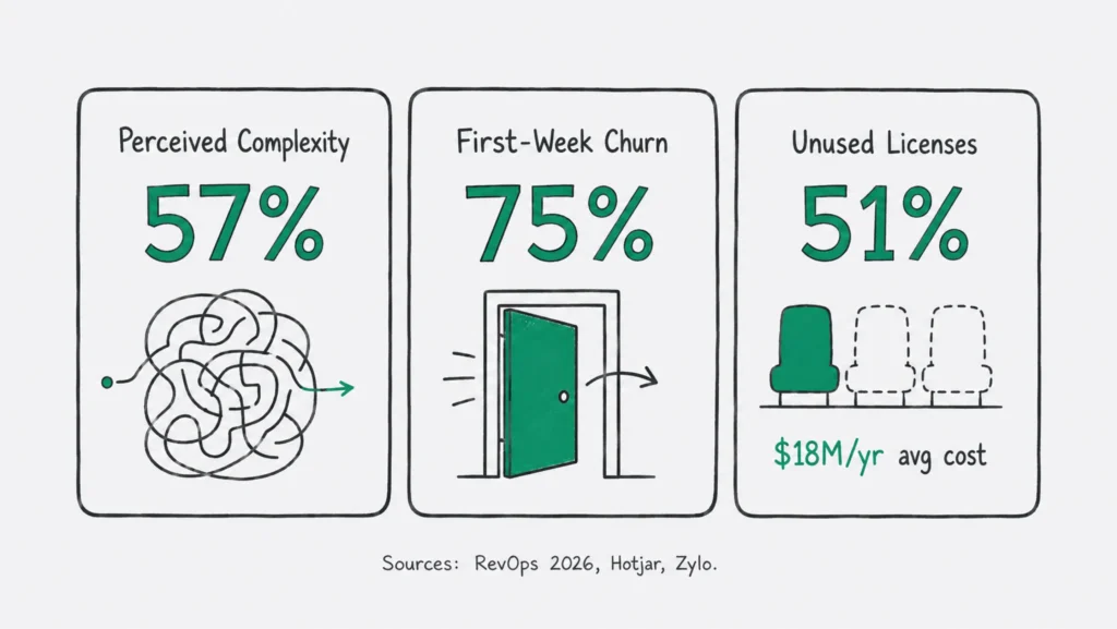
A 2026 RevOps benchmark report found that 57% of SaaS churn involves products perceived as too complex. Not broken. Not technically deficient. Just harder to use than users are willing to tolerate. According to Hotjar research, 75% of users churn in the first week, almost always because of onboarding friction, not product quality. And Zylo’s enterprise data shows that 51% of SaaS licenses go completely unused, costing enterprises an average of $18 million a year. That is not a development problem. That is a design problem.
The trap most B2B SaaS teams fall into is treating UX as a finishing layer. Build the product, then design it. Ship the features, then make them look good. The result is a product that functions correctly and communicates nothing to users, to buyers, or to the market.
McKinsey & Company tracked 300 publicly listed companies over five years and found that top design performers achieved 32% higher revenue growth and 56% higher total returns to shareholders than their peers. The difference wasn’t aesthetic. It was whether design was connected to business decisions at every stage of the product, not applied at the end.
A B2B SaaS UX audit is how you make that connection. Here is the checklist we follow.
The B2B SaaS UX/UI website audit checklist
Step 1: Understand the full technical capabilities
The audit starts here, before any design conversation. We need to understand what the product can actually do: not the pitch deck version, but the real version. What the technology supports, what it doesn’t, what’s constrained by architecture decisions already made, and what’s sitting in the product undiscovered because it was never properly designed for.
This matters more than most founders expect. Some of the most significant product opportunities we find in audits are features that already exist but are invisible to users because no one ever thought about how to surface them.
In all three of our current greenfield projects, this step looked different. For the AI-generated prototype, the technical capabilities were broader than the founder realized in some areas and narrower in others than the roadmap assumed. For the developer build, the architecture had created a data structure that would constrain certain UX patterns we might otherwise reach for. Knowing that before designing anything saved weeks.
Checklist: Technical capabilities
- What does the product currently do, end to end?
- What are the known technical constraints or limitations?
- What’s on the product roadmap and what’s been deprioritized?
- Are there existing features that are underutilized or hard to discover?
- Does the product architecture create any UX constraints we need to design around?
- What integrations exist and how do they affect the user experience?
Step 2: Identify and define the north star
Every founder we work with comes in knowing what they want. Usually several things. More trials, better activation, stronger retention, a clearer position in the market before a raise. What’s harder is knowing which goal to orient around first, and what trade-offs that choice requires.
We don’t arrive with a north star predetermined. We help clients define and refine theirs by asking the questions that surface tension between goals, pressure-testing assumptions about what success actually looks like at this stage, and finding the opportunities the team is too close to the product to see clearly.
With one of our current greenfield founders, the initial north star was “get to ten paying customers.” The audit revealed that the product’s strongest natural use case was actually in a slightly adjacent market: one with less competition, higher willingness to pay, and a cleaner activation path. That shift changed the design priorities significantly.
Checklist: North star definition
- What does success look like in the next 12 months?
- What single metric, if it moved, would change everything else?
- Where are the gaps between what the product promises and what it currently delivers?
- What do your best potential customers have in common?
- Are there adjacent problems the product could solve that no one is solving well?
- What would have to be true for this to be the obvious choice in its category?
Step 3: Understand the development team’s process
A product strategy that the development team can’t execute is not a strategy. It is a wishlist.
We spend real time understanding how the dev team works: how they prioritize, how they ship, how they handle feedback, where design currently sits in that process, and what the backlog looks like. This isn’t about auditing the engineers. It’s about making sure the roadmap we help build is one they can actually deliver, with design integrated into the process in a way that improves output rather than creating friction.
For the technical template project we’re working on right now, this step revealed that the dev team had been making design decisions in the absence of any UX input. Not because they wanted to, but because there was no process for bringing those decisions earlier. The audit created the opening to change that.
Checklist: Development process
- How does the team currently move from idea to shipped feature?
- Where does design fit: before development decisions, or after?
- How are priorities set and who has final say?
- What does QA and testing look like?
- What’s in the backlog and what has been deprioritized, and why?
- How does the team handle bugs versus new feature development?
Step 4: Gather requirements
This is the most comprehensive step in the B2B SaaS UX audit and the one most teams skip. Requirements gathering means understanding three distinct categories of need: what users need to accomplish, what the business needs the product to do or demonstrate, and what the broader context (investment, compliance, partnerships) requires.
User requirements
- Who are the actual users of the product, and what are their roles and workflows?
- What are they trying to accomplish, and what gets in their way today?
- What do they wish the product did that it doesn’t?
- Where does the current product serve them well, and where does it lose them?
Business requirements
- Are there compliance, legal, or regulatory constraints the product must meet?
- Are there enterprise customer requirements driving specific features?
- What operational constraints (support load, implementation time, onboarding cost) affect how the product should be designed?
- What partnerships or integrations are strategically important to the business?
Investment requirements
- Is there an active fundraise or a planned raise in the next 12 months?
- What does the product need to demonstrate to move from this stage to the next?
- Are there specific metrics, features, or use cases investors have flagged as priorities?
- How does the product currently communicate its market fit and growth trajectory?
Most UX audits stop at the user. We think about all three audiences because the product has to work for all three. According to ChartMogul’s analysis of B2B SaaS products in 2026, the median free trial conversion rate sits at 8%, and the top 20% of self-serve products convert at 10x the rate of the bottom 20%. The difference almost never comes down to features. It comes down to whether the product was designed with a complete picture of who it needs to work for and why.
Step 5: Competitive analysis, the marketing layer
Before we design anything, we look at how the competitive landscape is marketing the same problem. Not to copy, but to understand the conversation the product is entering.
What language are similar companies using? Are they making any promises? What pain points do they lead with, and how do they frame features as solutions? Understanding this shapes how we position the product we’re auditing: not just to be different, but to be meaningfully better in a way the market can immediately recognize.
For one of our greenfield founders, this step revealed that every competitor in the space was leading with feature lists. Nobody was leading with outcomes. That was the opening. The positioning we developed led with the specific result a user achieves in their first session, and it stood out immediately.
Checklist: Marketing competitive analysis
- Who are the top three to five competitors in this space?
- What is each competitor’s core value proposition?
- What language and pain points do they lead with?
- Which features do they emphasize and how do they frame them?
- What does their content strategy look like and what are they ranking for?
- What does their pricing page communicate about positioning?
- Where are they targeting that this product isn’t, and vice versa?
Step 6: Competitive analysis, the feature layer
The marketing layer tells you how competitors talk about what they do. The feature layer tells you what they actually offer, how they’ve implemented it, and where the real gaps are.
We go feature by feature across the competitive set: how does each competitor implement this capability, how is it surfaced in the interface, how does it work in practice, how is it priced or gated? This level of detail turns a competitive analysis from a summary slide into a genuine strategic input.
Checklist: Feature competitive analysis
- What are the core features in this product category?
- How does each competitor implement each feature?
- Which features are table stakes, which are genuine differentiators, and which are promised but poorly executed?
- How are features gated: by plan, by role, by usage volume?
- Where do competitor implementations create friction or fall short for users?
- What features are conspicuously absent across the competitive set?
That last question is often the most valuable. A feature that no one has built well, but that users clearly need, is a product opportunity waiting to be claimed. This is where we find them.
Step 7: Customer sentiment on competitor products
The most honest signal about any product category is the feedback left by the customers of its competitors.
We systematically review what users are saying about competitor products in G2, Capterra, app stores, community forums, Reddit threads, and LinkedIn comments. What do they love? Is there something that consistently frustrates them? What have they asked for and never received? What workarounds have they built because the product doesn’t support what they actually need?
This is primary research, available for free, that most B2B SaaS teams never look at. It is also some of the most actionable input we bring into the audit.
When we worked with CareSight, a B2B SaaS healthcare monitoring platform, this step surfaced a consistent complaint across competitor reviews: onboarding required IT involvement at every step, which made setup slow and fragile in clinical environments. That single insight became a core design principle. We built the onboarding to remove IT dependency entirely, collapsing a four-screen flow into one. That decision came from customer sentiment research, not interface design intuition.
Checklist: Competitor customer sentiment
- What praise comes up consistently in competitor reviews?
- What complaints appear across multiple products in the category?
- What feature requests show up in public forums or community boards?
- What workarounds are users building to compensate for gaps in existing products?
- What do churned customers cite as their reason for leaving?
- What language do satisfied customers use when recommending a product to someone else?
Step 8: Spot the opportunities
Everything gathered in steps one through seven feeds into this moment. This is where we stop collecting and start seeing.
Opportunities in a B2B SaaS UX audit come in three forms. Experience opportunities: places where friction in the current product can be removed through better design. Product opportunities: capabilities that users need and no competitor offers well. And positioning opportunities: ways to frame what the product does that the market isn’t currently claiming.
We map these against the north star from step two, the technical reality from step one, and the full requirements picture from step four. The result is a prioritized set of opportunities ranked by business impact, feasibility, and strategic fit. Not by what’s easiest to design, or what a stakeholder asked for loudest.
Research from Hotjar shows that 66% of B2B customers stop purchasing after a bad onboarding experience, and products with structured onboarding see 50% higher retention. In our experience across greenfield and existing product audits alike, the onboarding problem is almost never a screen design problem. It’s a strategic problem: a mismatch between what the product assumes users know and what they actually arrive knowing. The audit is what surfaces that gap before design work begins.
Checklist: Opportunity mapping
- Where does the current product create friction that better design can remove?
- What capabilities do users need that no competitor offers well?
- What positioning angle is unoccupied in this market?
- Which opportunities align with the north star and are technically feasible?
- What is the highest-impact change we can make with the lowest implementation cost?
Step 9: Build the strategy
The B2B SaaS website UX/UI audit checklist ends here, and the real work begins.
The strategy we build from the audit is not a design brief. It is a growth plan: what to build, in what order, for which users, measured against which outcomes, communicated in which way to which market. Every decision in it is traceable back to something we learned in the audit. Not a preference, not an assumption, not something a stakeholder asked for because a competitor had it.
For our three current greenfield projects, this step looks different for each founder. One needs a go-to-market positioning strategy before a single additional feature is built. One needs a phased product roadmap that moves the architecture toward the north star in a sequence the dev team can actually execute. The third needs an investor-ready product narrative, built from the audit findings, that shows not just what the product does today but what it’s clearly becoming.
That range is the point. The B2B SaaS website UX/UI audit checklist is a process, not a template. What it produces depends on what the business actually needs, which is exactly what the audit is designed to find out.
What a real B2B SaaS website UX/UI audit delivers
Most founders who go through this process tell us the same thing: they came in thinking they had a design problem and left with a product strategy.
That’s the point. A B2B SaaS website UX/UI audit checklist that stops at interface usability is working at the wrong level. Interface problems are almost always downstream of strategy problems: unclear positioning, incomplete requirements gathering, a north star nobody has explicitly agreed on, competitive blind spots that have quietly shaped the wrong product decisions.
The audit surfaces all of it. And because it surfaces all of it at once, in one connected picture, the strategy that comes out of it actually holds together, rather than being a collection of well-reasoned individual decisions that don’t add up to a coherent product.
That is what we are building with each of the three founders we are working with right now. And it is what the audit makes possible.
Key takeaway
- A B2B SaaS website UX/UI audit checklist should cover the full strategic picture: technical capabilities, north star definition, development process, user and business and investment requirements, competitive intelligence at both the marketing and feature level, and customer sentiment across the competitive set.
- The most valuable inputs in a B2B SaaS website UX/UI audit often come from what competitor customers are saying publicly: what frustrates them, what they’ve asked for, and what workarounds they’ve built.
- Interface problems in B2B SaaS products are almost always downstream of strategy problems. The audit works at both levels simultaneously.
- The goal of a B2B SaaS website UX/UI audit is not a list of design fixes. It is a prioritized growth strategy built from the fullest possible picture of the product, the users, the market, and the business.
- Greenfield products (half-built codebases, AI-generated prototypes, technical templates) benefit from a UX audit before additional development investment, not after.
FAQ
What is a B2B SaaS website UX/UI audit?
A B2B SaaS website UX/UI audit is a comprehensive discovery and strategy process that evaluates a product and its full context: the technology, the team’s process, the users, the business requirements, the investment context, and the competitive landscape. The output is not a usability report. It is a growth strategy: a prioritized roadmap of what to build, for whom, in what order, and why.
How is a B2B SaaS website UX/UI audit different from a UX checklist?
A checklist is a starting point. An audit is a process with real research behind it: technical discovery, stakeholder and user interviews, competitive analysis, customer sentiment research, and strategic synthesis. The checklist in this post outlines the steps we follow. Each step involves genuine investigation. The checklist tells you what to look at. The audit tells you what it means and what to do about it.
When should we do a B2B SaaS website UX/UI audit?
You should do a B2B SaaS website UX/UI audit three moments where the audit has the highest impact: before significant additional development investment (so you’re building the right thing, not more of the wrong thing), before a fundraising round (so the product clearly reflects where the business is going), and when a product is built but growth has stalled and the team can’t agree on why. For greenfield products especially (prototypes, AI-generated builds, developer templates) the audit should come before the next phase of development, not after.
How long does a B2B SaaS website UX/UI audit take?
A B2B SaaS website UX/UI audit should typically run three to six weeks (It depends on scope). This includes technical discovery, stakeholder and user interviews, competitive analysis at both the marketing and feature layer, customer sentiment research, and strategy development. Audits that skip the research phase tend to produce recommendations that sound right and don’t work.
What makes the Growth UX Studio’s audit different?
We integrate with the whole business, not just the design problem. Our audit sits at the intersection of product strategy, user experience, and business growth, which means the output is as useful to a founder preparing a raise as it is to a product manager planning the next sprint. We work with B2B SaaS companies from zero to one and from seed through Series B. The audit is always where we start. Talk to us about what that could look like for your product.
Ready to see what your product is actually capable of?
If you’re building a B2B SaaS product and something isn’t adding up: the structure isn’t intuitive, the growth isn’t where it should be, or you’re about to invest significantly in development and want to make sure you’re building the right thing, we can help. At The Growth UX Studio, the audit is where every engagement begins. Because strategy without a foundation isn’t strategy. It’s guessing. Let’s talk.