
E-commerce has been around for about 30 years. The first secure online transaction was completed using encryption technology in 1994, and both Amazon and eBay launched their websites in 1995. But while e-commerce technically began in the mid-1990s, it really took off in the last decade and continues to grow rapidly. Faster internet, smartphones, improved payment infrastructure, and growing consumer trust fundamentally changed people’s habits and how they shop.
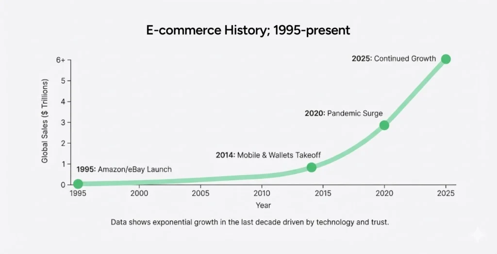
Global e-commerce sales have surged as more businesses moved online, more consumers became comfortable buying digitally, and more infrastructure emerged to support selling across borders. Platforms like Shopify dramatically lowered the barrier to entry, making it possible for small brands, solo founders, and growing companies to launch and scale faster than ever before.
What’s especially interesting is that this shift hasn’t only helped small to mid-size companies. Established brands that have been around for many generations are now opening storefronts on Shopify and similar platforms. (Some examples are Aldo, and even giants like Nestlé and Mattel.)
For the first time in history, anyone can open a store in the same “space” or “mall” as a much larger brand, and directly compete with them. Something that simply wasn’t imaginable or possible 15 or 20+ years ago.
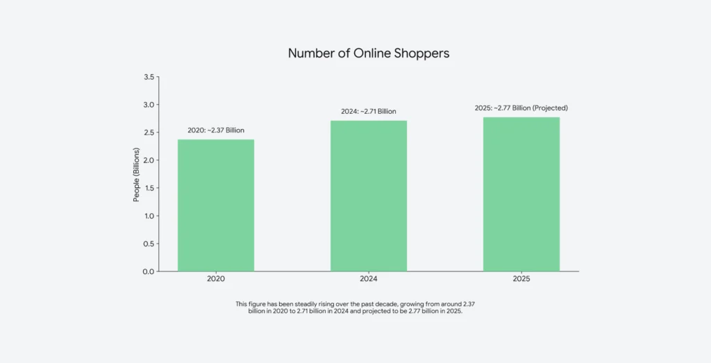
Today, a brand doesn’t need physical retail, massive distribution deals, or regional dominance to succeed. The world has effectively become smaller. Customers regularly buy products from businesses halfway across the globe, and shipping, payments, and logistics continue to improve year after year to support that growth. With a world population of 8.1 billion people, 2.7 billion of them shopping online (and that number is growing every day), e-commerce still presents a huge opportunity for new and existing sellers alike. We’re not even close to saturation yet, and we won’t get there in your or my lifetime.
The shadow side of e-commerce growth: ux debt is wasting your customer acquisition cost dollars
This rapid growth, however, comes with a quieter (but opportunistic) downside.
UX debt compounds quickly. It builds with every moment of hesitation, friction, confusion, or abandonment. It’s the cost of small design decisions made without a deep understanding of buyers, stacking up over time. You pay a lot to acquire your customers, and lose many of them forever. You have to assume that people are always one click away from leaving your site to visit another. Competition is fierce. UX is critical, so you can keep those customers you paid so much to find on your site.
The good news is, there are a lot of what we call “tablestakes” user experience mends you can make on your site today that can reduce your UX debt. We’ll look at why designing for stakeholders rather than buyers is one of the most common sources of friction, the e-commerce details teams consistently overlook, and how AI can support e-commerce design when the fundamentals are in place.
But first…how to identify ux debt in ecommerce website design
UX debt is the gap between how a site should work for buyers and how it actually works because of shortcuts, assumptions, or internal compromises.
In practice, UX debt in ecommerce website design often shows up as experiences that technically function but feel harder than they should. Navigation may make perfect sense to the internal team, but feels unintuitive to customers. Product pages might be packed with content yet still fail to answer the questions shoppers actually have about your product. Checkout flows may work technically end-to-end, but feel mentally exhausting rather than confidence-inducing.
These patterns usually come from well-intentioned decisions: copying competitors, accommodating internal requests, or adding features without understanding buyer intent. Over time, they add friction rather than remove it.
Unlike technical debt, UX debt isn’t always obvious to internal teams. Stakeholders know the product, the brand, and the business context. Buyers don’t. They arrive with expectations shaped by every other e-commerce experience they’ve had, and they will stack how they felt about yours based on those expectations immediately.
When UX debt accumulates, conversion rates flatten, cart abandonment rises, and teams often find themselves redesigning again and again without ever addressing the underlying problem.
Designing for stakeholders instead of buyers creates invisible friction
One of the biggest contributors to UX debt in ecommerce website design is designing for stakeholders instead of buyers.
This happens frequently in larger organizations or teams that are newer to ecommerce. Someone internally says, “I think this should be more prominent,” or “I feel like users need to see this first.” Or one of the all-time favorites: “Well, X store does this—let’s do it too.” These opinions are usually well-intentioned, but they’re not grounded in buyer behavior or customer-first design.
One of the great benefits of having good UX and UX-ers in place is that user experience is a science. Unlike art, design is not subjective. Design is custom to the person using it. It’s not about personal taste or what feels right to you. Remember, you are not your user. It’s not about you – it’s about how your real customers think, decide, hesitate, and commit.
When stakeholder opinions (however well-meaning) override UX expertise and data, edge cases begin to crowd out primary buyer goals.
Great ecommerce website design requires someone whose job is to advocate for the buyer relentlessly—even when that means pushing back on internal assumptions. UX professionals bring research, behavioral patterns, and cross-industry experience that individual stakeholders simply don’t have.

Meet your customers where they are. Walmart isn’t Tiffany’s, and your small business isn’t Amazon. They’re all deliciously different.
Every ecommerce audience comes in with different expectations. What works for a luxury fashion brand won’t work for a home improvement retailer. What converts for subscriptions won’t convert for one-time purchases. Price sensitivity, urgency, trust thresholds, and product complexity are all factors to how buyers move through a site.
This is why ecommerce website design needs to start with an understanding of why users are arriving, what they’re comparing you against, what concerns they need resolved before buying, and how much cognitive effort they’re willing to expend. (Hint: it isn’t a lot :-))
Assuming users “will figure it out” is one of the fastest ways to create UX debt. The job of ecommerce design is to remove the need for figuring things out entirely.
Don’t ignore these ecommerce website design details
Many ecommerce teams focus heavily on homepage aesthetics or product imagery while missing quieter details that have an outsized impact on conversion. These overlooked areas are often where UX debt (and the bigger opportunity) hides.
Some of the most commonly missed details include clearly surfacing key product information early on the product detail page, such as dimensions, materials, compatibility, care instructions, or usage context. Buyers shouldn’t have to hunt for basic product information. Take the time to understand the problem your product solves for customers, and address anything that could help them determine whether the product fits their use case. For example, if this is a piece of furniture, make sure the dimensions are clearly labeled. If it’s clothing, the material, wash instructions, etc.
Other powerful details include showing how a product fits into a real-world customer scenario, clarifying shipping timelines before checkout, answering return questions proactively, and making comparisons easier when products are similar. You lose conversions the moment your customer hesitates to buy your product. Answer any and every question or concern they may have, and you’ve earned yourself a sale, and even more importantly, a repeat customer.
A quick note on the UX of localization
Offering multiple languages isn’t the only path to localization. Localization in ecommerce website design means meeting shoppers in their own language, mindset, values, currency, measurement units, address formats, payment preferences, shipping expectations, and cultural trust cues.
A site that’s technically translated but not localized can quietly signal, “This wasn’t really built for you,” or even, “You’re not important enough,” or “We don’t actually ship to your country.” That hesitation alone can stop a purchase. True localization reduces friction by aligning the experience with how buyers already expect to shop in their region.
Make it real easy for people to pay.
Many ecommerce sites technically support multiple payment methods, but very few make paying easy. We make people dig for shipping information and timelines, and we overload them by requiring them to create accounts before trust is established, among other things.
In ecommerce website design, checkout should feel like a quick and natural continuation of the buy process. You know how people spend all the time they want shopping for things in a physical store, sometimes hours, yet suddenly, when they get to the checkout counter, they’re in a huge rush. It’s uncanny. And the same holds true for ecommerce. When a person is done shopping, they just want to get the transaction done as quickly as possible. Transparency is super important, too. Buyers want to know their money is secure, what will happen if they need to return something, and exactly what they’re being charged before they commit. Answering those questions upfront builds trust and keeps momentum intact.
Deploy trust triggers to reduce hesitation at the moment of purchase
Trust is built throughout the buying journey through multiple interactions and micro-interactions with your site. Clear return policies, delivery timelines, security cues, social proof, and clean visual hierarchy all play a role.
When these elements are missing, unclear, or buried, buyers hesitate. Their hesitation is your UX debt. The best ecommerce sites anticipate doubt and address it before users become consciously aware of it.
Conversion rate optimization
Conversion rate optimization is often misunderstood as a collection of hacks or experiments. In reality, effective CRO in ecommerce website design is about maintaining momentum.
Momentum comes from clear next steps, reduced decision fatigue, familiar patterns that align with buyer expectations, and consistent messaging from entry to checkout.
When teams chase isolated optimizations without addressing the overall flow, they often add complexity rather than remove it. Over time, that complexity becomes UX debt. That’s why you need an ecommerce web design agency that can see the bigger picture.
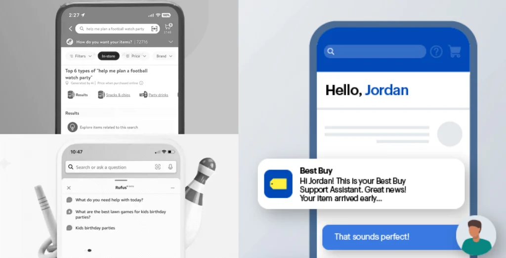
AI can support ecommerce website design when UX foundations are strong
AI has opened up new possibilities for ecommerce, even ways to make it more “human” and better mirror a tangible shopping experience. On a well-designed site, AI can support buyer confidence in meaningful ways. It can help buyers answer questions faster and visualize outcomes more clearly.
Practical examples of AI-powered e-commerce enhancements
AI-powered product visualization allows customers to see items in context—whether that’s furniture in a room, finishes on a product, or variations in color and size. Fit and size recommendation tools reduce uncertainty for apparel and wearable products. These tools make shopping feel more real and tangible.
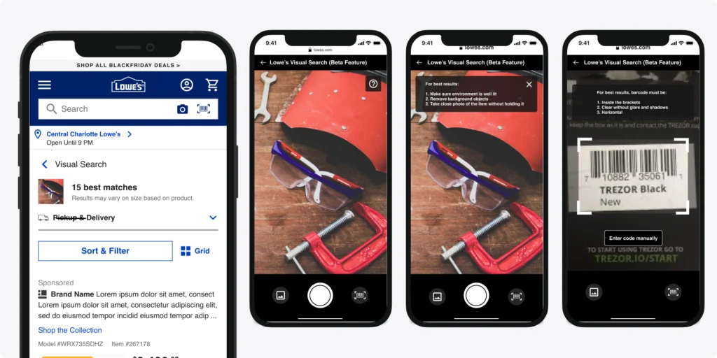
We designed visualizers for Lowe’s that let customers see how tile or flooring would look in their own space before buying. This solves a huge customer problem: the fear of making an expensive, irreversible decision without truly knowing how the final result will look.

Smart search and discovery tools also help users find relevant products faster, especially in large catalogs. Personalized recommendations can support decision-making when they respect user intent instead of overwhelming it.
NLPs can help summarize reviews and customer sentiment so people can quickly determine whether a product fits their use case, based on real customer reviews, without having to parse through reviews themselves.
What to look for in an ecommerce website design agency today
When looking for the right e-commerce website design partner, look for one that understands buyer psychology, knows when to simplify, and is comfortable saying no to ideas that don’t serve the user (and thereby, don’t serve your business, either)
Look for teams that lead with UX strategy, use research and data to guide decisions; understand ecommerce across platforms and industries; design with scalability and iteration in mind; and treat conversion as a system, not a page-level metric.
An agency that prioritizes UX debt reduction helps you build a site that improves over time—rather than one that quietly accumulates hidden costs.
The Growth UX Studio team has 15+ years of experience working in commerce and e-commerce for companies of all shapes and sizes.


If you’re carrying UX debt in an existing e-commerce experience or you’re building a new one, we’d love to be the Dave Ramsey to your UX debt. We help you clean it up and build long-term growth into your ecommerce website design.
Reach out today, we love chatting e-commerce!
Need a UX partner who understands business and designs for growth?
Let’s talk—Contact us today.