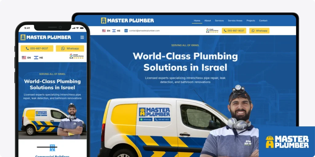
‘A Master Plumber’: A bilingual, built-for-conversions website for an Israeli plumbing brand
A Master Plumber came to us with a challenge that’s really common for trades businesses in Anglo-speaking areas of Israel:
“We want our website to serve both native Hebrew and English-speaking clients equally.”
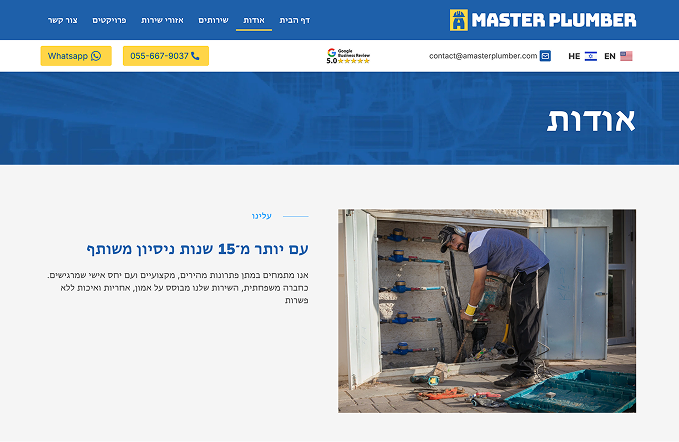
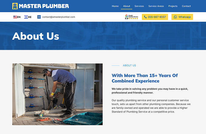
Ariel from ‘A Master Plumber’ has been in business for 10+ years, but has never had a website or any marketing, for that matter. His business has all grown through word-of-mouth. He has an excellent reputation and is always busy, but he wants to focus more on marketing specific services that he specializes in and branch out to work in more areas of Israel.
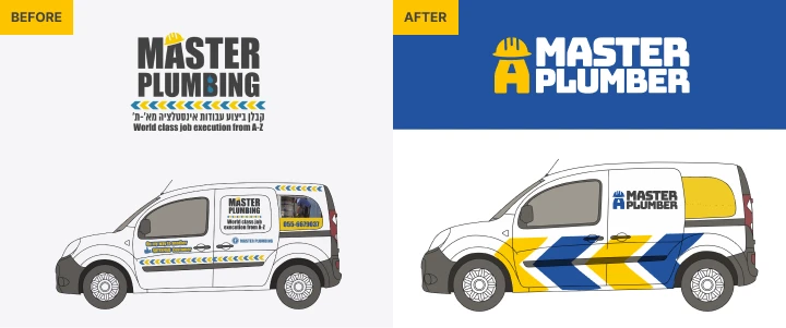
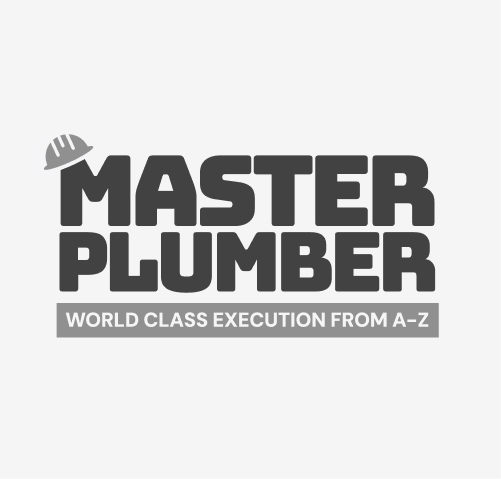
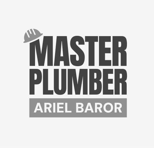
His current logo was about 10 years out-of-date and was created for print materials and not optimized for digital, and seeing how he didn’t have a website, we’d be starting everything from scratch.
We chose the domain name of “amasterplumber.com”, adding the “a” before his previous business name, Master Plumbing. It’s a fun double meaning. The ‘A’ stands for Ariel, but also reads as a statement of expertise: he is a master plumber.
Our overall goal for this project was to build an experience that instantly felt like Ariel and how people know him – reliable, local, trustworthy, and human.
01 A brand identity people can trust at first glance.
Ariel’s reputation was already strong, we just needed the brand to reflect it. The old logo wasn’t optimized for digital and didn’t communicate the authority of someone who has been in the field for over a decade.
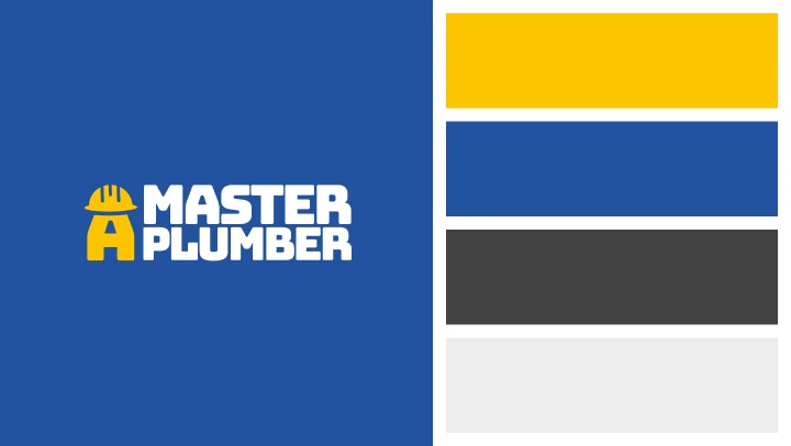
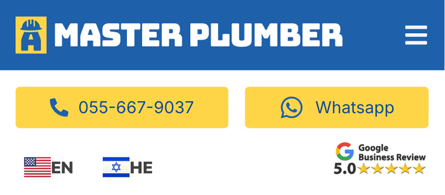
We created a clean, recognizable visual system that works equally well in Hebrew and English. Bold, high-contrast colors. Scalable iconography. Distinct typography. A logo that feels modern, approachable, and instantly legible — even from a plumber’s van driving past you at 60 km/h.
Bold industrial style with strong visual impact and confident trade presence.
Clean, structured typography offering clarity and a modern professional feel.
Tall, authoritative layout emphasizing craftsmanship and dependable service identity.
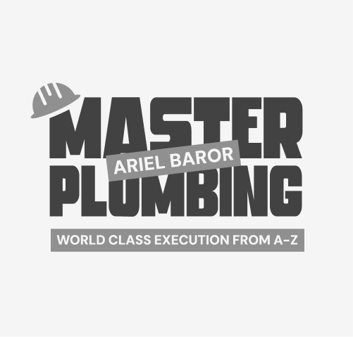
Pipe-inspired letters and hard-hat “A” create a memorable, personalized plumbing symbol.
Old logo → New logo evolution description
The old logo used bold typography and directional chevrons but lacked clarity and cohesion. It communicated energy but didn’t strongly represent plumbing as a craft, nor did it reflect Ariel’s role as the master technician.
The final redesign preserves that sense of bold reliability but transforms it into a cleaner, more intentional system. By integrating pipe-inspired letterforms and the distinctive “A + hard hat” mark, the new logo becomes both a brand identity and a personal signature — something the old mark never achieved.
Visual design goals:
✔ A modern, professional logo – to be clean and instantly recognizable on vehicles, social feeds, Google Maps, print, and anywhere else he may choose to use it.
✔ A strong color palette that exudes authority and trust – Colors that make sense for home services: reliable, approachable, and visible even when customers are stressed.
✔ Typography and icons built for clarity – Readable in both English and Hebrew, scalable to any size, and easy for customers to scan quickly.
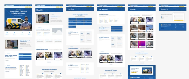
02 UX strategy and design
Plumbing clients aren’t typically browsing for fun. They’re looking for someone who can solve their problem today.
Our goal was to create a site where the next, actionable step meets the target audiences expectations and intent.
WhatsApp is the primary communication channel in Israel, so we made sure that contacting Ariel via WhatsApp is immediately visible and accessible in the navigation bar. The nav stays sticky on both desktop and mobile, giving users one-tap access to WhatsApp or a direct phone call at any point in their browsing.
We also created his Google Business profile and linked to it directly from his site, so tapping the navigation link opens his verified business listing instantly. This also allowed us to showcase his 5-star rating in the homepage hero — a powerful trust signal that helps new customers feel confident right away.

03 Content strategy for trust at every touchpoint
To prime users for conversions, we implemented:
- A sticky WhatsApp button on mobile
- A WhatsApp CTA in the header
- WhatsApp buttons inside service pages
- Large high-contrast “WhatsApp” components throughout the site
- A sticky call bar
- Tap-to-call actions everywhere
- Repeated “Call Now” buttons with local dialing
- Quick access from the hero section
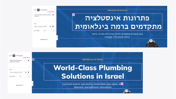
03 The Israel challenge: two languages, two directions, two audiences
This is where things got interesting.
Designing a bilingual site is easy.
Designing a good multilingual experience — especially in Israel — is not.
Why?
Because English reads left → right And Hebrew reads right → left.
That means:
- the entire layout direction changes
- spacing flips
- icons flip
- navigation reverses
- typography behaves differently
- user expectations shift
- and the content itself can’t simply be “translated”
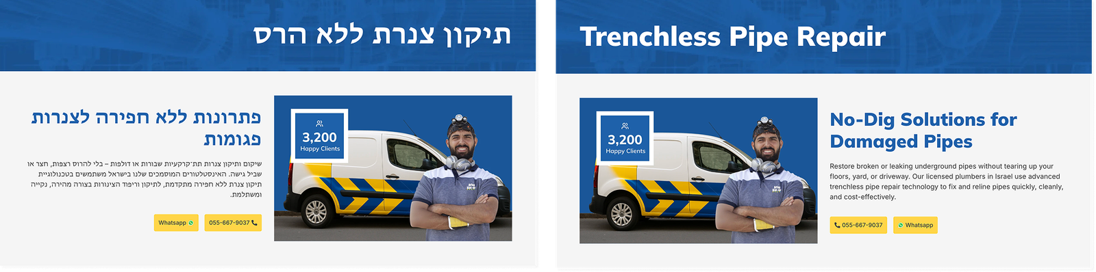
So we built two versions of the website that feel native to each audience.
✔ English version (LTR)
Clean, familiar Western layout.
✔ Hebrew version (RTL)|
Mirrored interface built specifically for local Israeli reading habits.
✔ And an effortless language switcher
Right where users expect it — always visible, always intuitive.
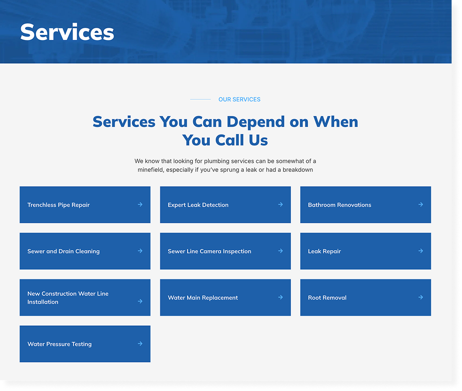
04 Information architecture: Built for urgency + clarity
This was another big challenge.
Hebrew and English search behavior in Israel is completely different.
An English speaker might search: “plumber in Israel” “leak detection Tel Aviv”
Hebrew speaker searches: אינסטלטור בתל אביב איתור נזילות פתיחת סתימות
These aren’t translations — they’re entirely different markets.
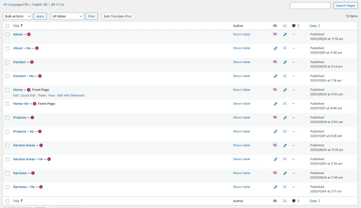
So we used Polylang to create two fully separate SEO ecosystems within one website.
✔ Two versions of every page
One in English, one in Hebrew.
✔ Unique titles, meta descriptions, and headers for each language
Not translated — actually optimized.
✔ Correct hreflang tags
Telling Google exactly who each page is for.
✔ Dual internal linking
So each language’s SEO supports itself.
The result?
Two audiences, two keyword groups, one website — no SEO conflicts.
Plumbing customers have two modes:
1. “Help, something broke.”
2. “I’m researching before something breaks.”
We built the IA to support both.
06 Technical architecture: Fast, stable & built to scale
Behind the scenes, this site needed to be more than bilingual — it needed to be fast, reliable, and SEO-ready from day one.
So we built a backend that supports long-term growth without slowing the client down.
✔ WordPress + Polylang Multilingual Engine
Two synchronized page trees — one for English, one for Hebrew — each fully editable and SEO-independent.
✔ Performance Optimizations
Because speed is everything when someone’s pipe just burst.
- caching layers
- CDN integration
- image compression and WebP
- lazy loading
- lightweight theme structure
- clean CSS & JS
- stable hosting setup
We kept everything as lean as possible. The final load time averaged 1.5–2 seconds, even on mobile networks.
✔ Technical SEO Foundation We made sure Google immediately understood the structure:
- XML sitemaps for both languages
- canonical tags
- schema markup (LocalBusiness, Service, FAQ)
- proper indexing rules
- automatic hreflang output
This is the stuff that isn’t flashy but makes a huge impact in search rankings.
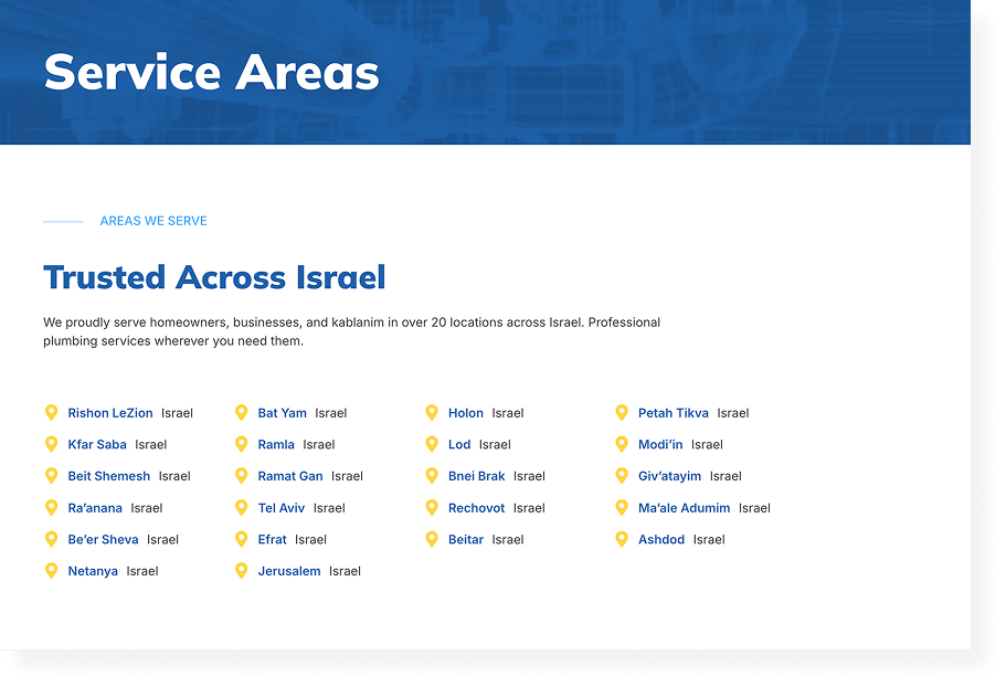
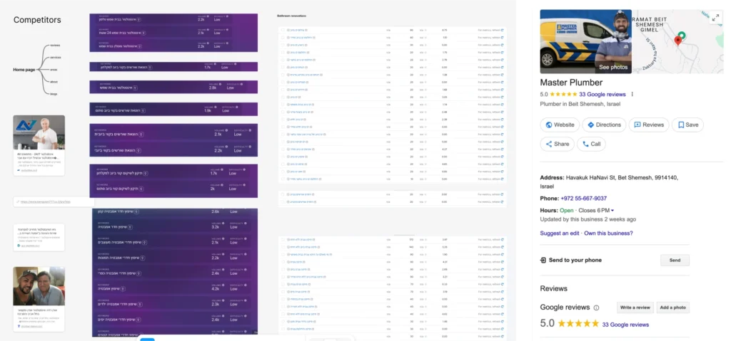
07 Local SEO & google business profile (GMB):
For plumbers, Google Maps visibility is half the battle.
So we treated the Google Business Profile like a core part of the homepage.
✔ We fully optimized the GMB
- categories
- services
- business description (in English + Hebrew)
- service areas
- photos
- branded graphics
✔ We added the GMB rating directly in the website header
Instant trust.
Higher conversions.
No friction.
✔ We created a review strategy
Templates + scripts in both languages so customers could easily leave reviews that actually help SEO.
✔ Weekly posts to signal freshness
Google rewards businesses that stay active.
The result?
More calls, more visibility, more trust right out of the gate.
08 Social media management: Consistency builds credibility
Most plumbing companies post once, get busy, and disappear.
We made sure A Master Plumber stayed present and professional.
✔ Branded templates for Instagram & Facebook
These matched the new brand identity — clean, helpful, trustworthy.
✔ English + Hebrew content
So both audiences always felt seen.
✔ Practical, human-centered content
- before/after repairs
- quick plumbing tips
- reminders for seasonal maintenance
- service highlights
✔ Calls to action in every post
Driving more WhatsApp messages, more calls, more site visits.
Not flashy — but incredibly effective for building brand familiarity.
Results: A plumbing brand that finally feels like a leader
In just the first 60–90 days after launch, the impact was clear.
📈 Search Growth
- +180% organic impressions
- +95% traffic to service-area pages
- 20+ local pages ranking in the top 10
- Strong growth for Hebrew AND English keywords
📞 Lead Performance
- Major increase in Google Maps calls
- Higher WhatsApp conversions
- Reduced bounce rate from speed + trust signals
✨ Brand Perception
A Master Plumber shifted from “another local plumber” to a professional, modern, bilingual service brand that customers feel confident calling in stressful moments.