
If you search for product redesign examples, you’ll find a lot of before-and-after visuals.
Cleaner, more modern interfaces. Better typography. Nicer colors.
But here’s the problem: most of those examples focus on how things look—not how they work, how they convert, or how they scale.
At The Growth UX Studio, we look at product redesign differently.
A product redesign isn’t about making something prettier.
It’s about making it clearer, more usable, and more aligned with how users think—and how the business grows.
In this article, we’ll walk through real product redesign examples and break down what actually changed, why it mattered, and how strong teams approach redesign as a growth lever—not just a design task.
What product redesign actually means
A product redesign is the process of rethinking how a product communicates, functions, and guides users—not just how it looks.
The best product redesign examples are ones that can clearly demonstrate improved understanding, decision-making, and action.
That usually involves:
- Reworking information architecture
- Clarifying user flows
- Improving messaging and hierarchy
- Reducing friction in key moments
- Aligning the experience with business goals
👉 Learn more about our approach to strategy and design here: Growth UX Studio Services
When a product redesign is actually needed
Before jumping into examples, it’s important to understand why redesigns happen. Companies don’t usually redesign their software just because it looks outdated. (Sometimes they think they are, but in reality, it feels old and clunky and doesn’t support a modern user experience that takes a true and evolved workflow into account.
1. Users don’t understand the product quickly enough
If users land and don’t “get it” within seconds, they won’t convert.
2. The product evolved—but the UX didn’t
Features were added over time, but the structure didn’t keep up.
3. Users feel overwhelmed or lost
Too many options, unclear paths, or poorly organized content.
4. The business model changed
New goals (monetization, acquisition, retention) require new UX.
These are the real triggers behind meaningful product redesign examples—not just visual refreshes.
Product redesign examples (and what actually changed)
Let’s look at real product redesign examples through a Growth UX lens.
Each one highlights a different type of redesign—and a different type of impact.
1. Tnuchamu — From overwhelming system → guided experience
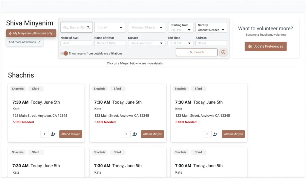
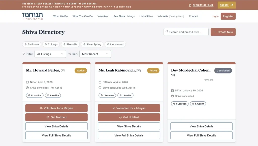
The problem:
Tnuchamu is a complex platform with multiple features, including individual profile listings, donations, many-faceted notifications, and more. Pre-launch, the product was designed as it was being developed in WordPress (a platform that eventually could not support it’s heavy features) difficult to navigate, with no clear hierarchy or guide to action.
What some teams would do:
Clean up the UI. Adjust layouts. Maybe simplify a few pages.
What we did:
- Reworked the information architecture
- Clarified core user journeys (donate, find, register) and business goals
- Shifted pages from content-heavy → action-oriented
👉 Read the full case study: Tnuchamu Case Study
Benefit of the redesign:
As Steve Krug wrote in his book “Don’t Make Me Think”, well…that’s what he wrote. When users don’t have to think as hard, they act more. Clarity reduces friction, and reduced friction increases engagement.
2. Management Controls — From clunky, broken legacy system → clear decision-making tool
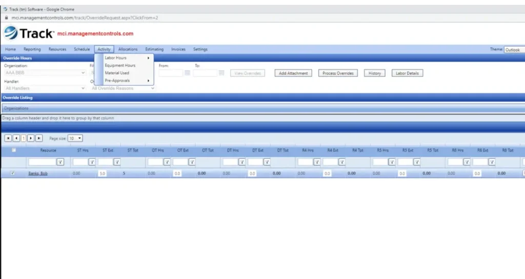
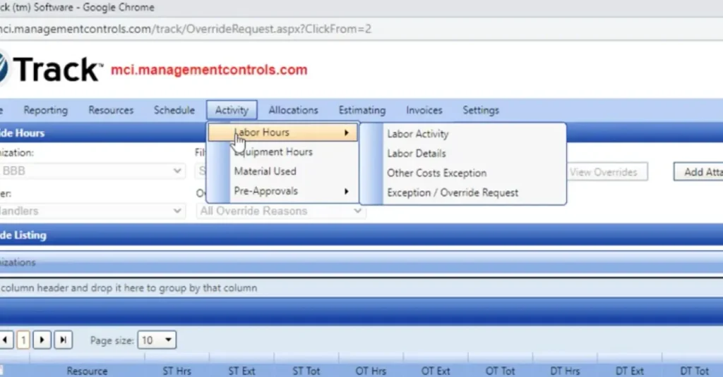
The problem:
Management Controls had an extremely data-heavy interface. While powerful, it made it difficult for users to extract insights quickly.
The system was built around a data structure, not user decisions.
What most teams would do:
Improve visuals. Add better charts. Reorganize components.
What we did:
- Reframed the interface around user goals
- Simplified data hierarchy and prioritization
- Made key insights scannable and actionable
The real redesign shift:
From “data display system” → “decision-support system”
Why it matters:
If users can’t act on the data, the data has no value. This is one of the most important lessons in real product redesign examples.
4. STAMP — From simple, informational starter site → authoritative and scalable business platform
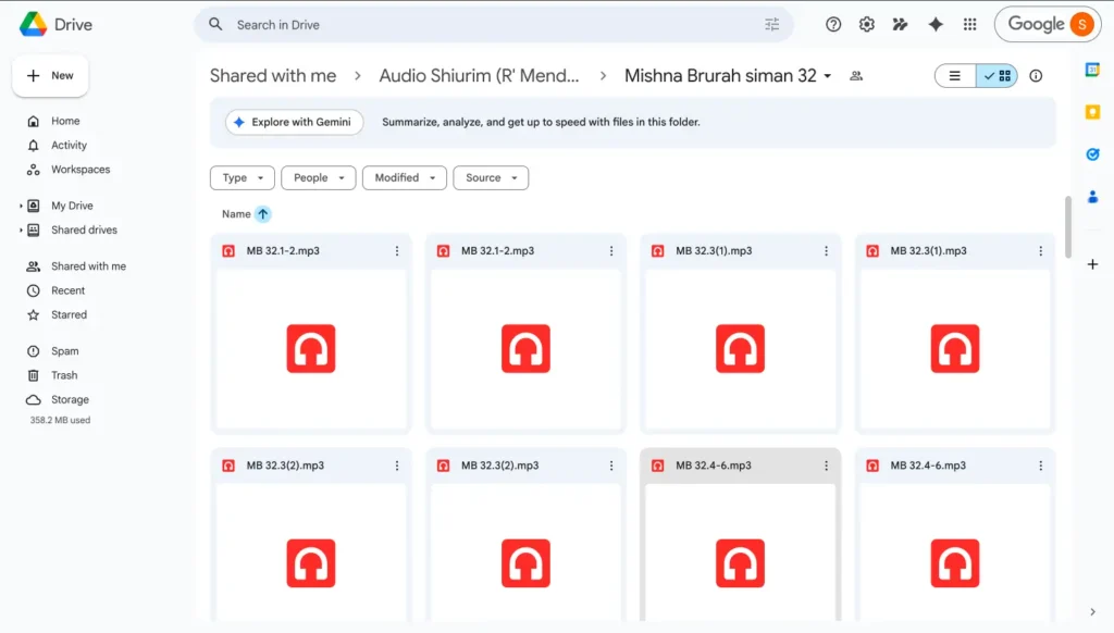
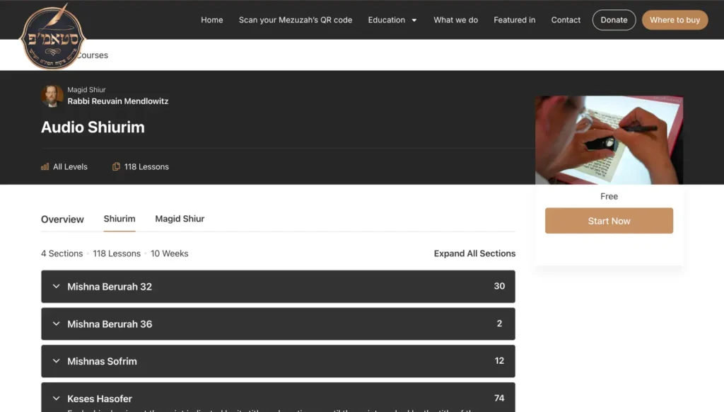
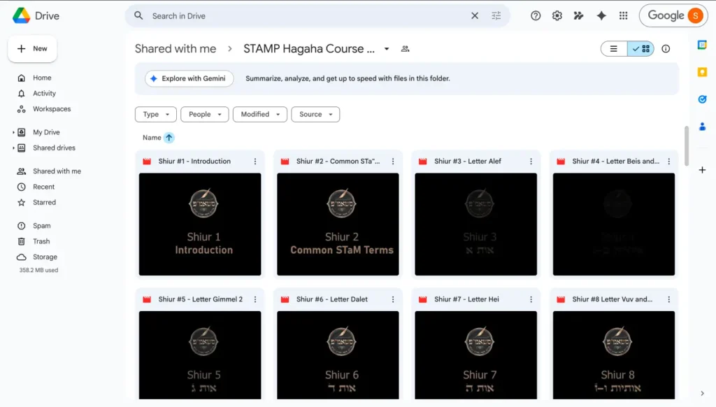
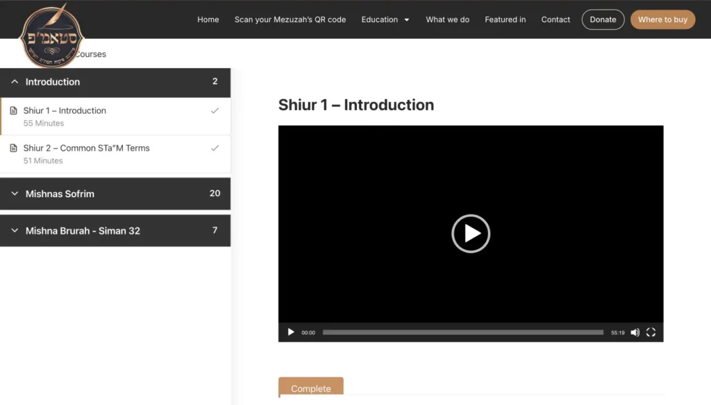
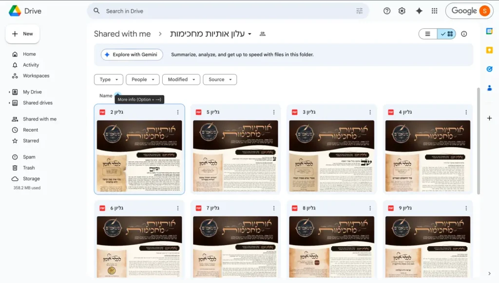
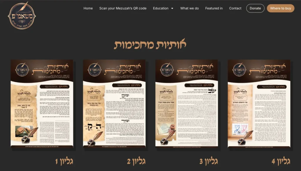
The problem:
STAMP was a young not-for-profit startup in the religious space with lots of nuance and had so far launched with a very basic ifnormational site. They started offering courses, both free and paid on the side which were hosted inside a Google Drive. There are features they wanted to offer for multipel user types which required a lot of UX thinking and a complete restructure of the site to meet multiple user intents as they build their authority and reach in their space, the certifictaion of religious items,
What most teams would do:
Redesign visuals. Improve the homepage. Tidy up sections.
What we did:
- Defined a clear information architecture and sitemap
- Organized and designed features into logical , easily maintainablr systems
- Introduced design system thinking early
👉 Explore our UX strategy work: [INTERNAL LINK: UX Strategy Service Page]
The real redesign shift:
From “a website with pages” → “a structured product ecosystem”
Redesign benefits:
Strong structure supports growth. It improves usability, onboarding, SEO and AEO, and long-term scalability.
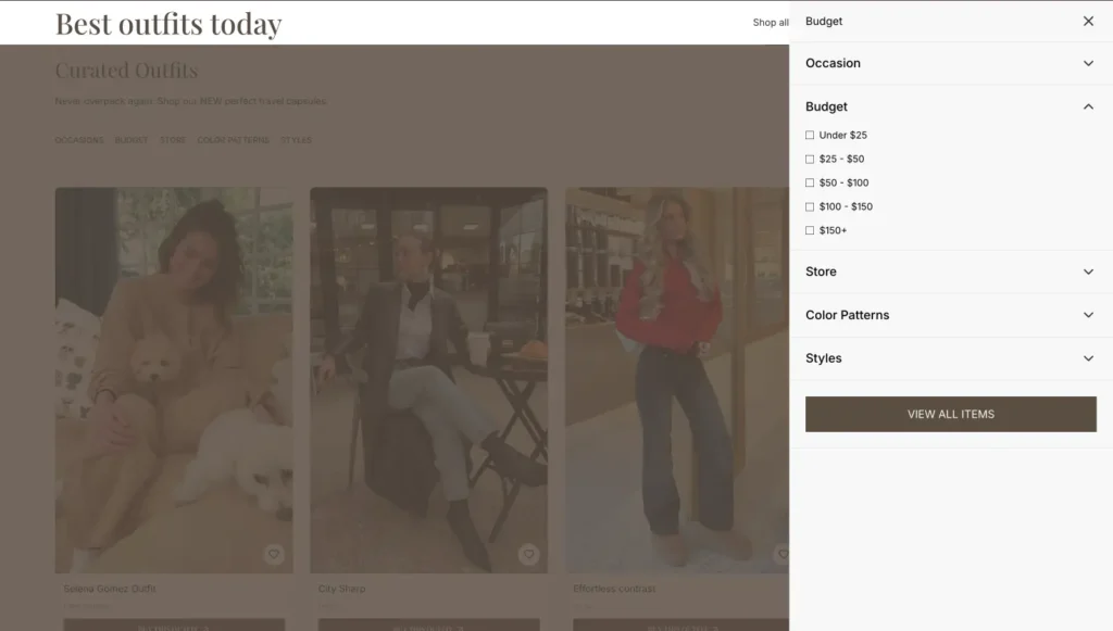
5. Best Outfits Today — From fragmented inspiration → all-in-one personalized decision-making
{Image suggestion: Pinterest-style endless scroll (or better) vs curated outfit grid with clear selections and filters}

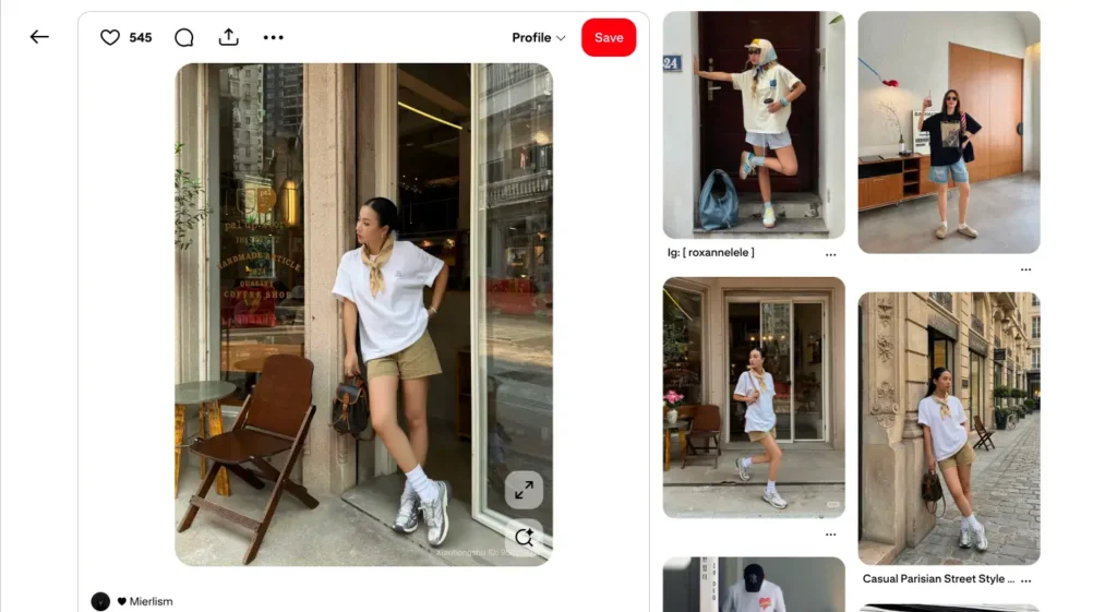
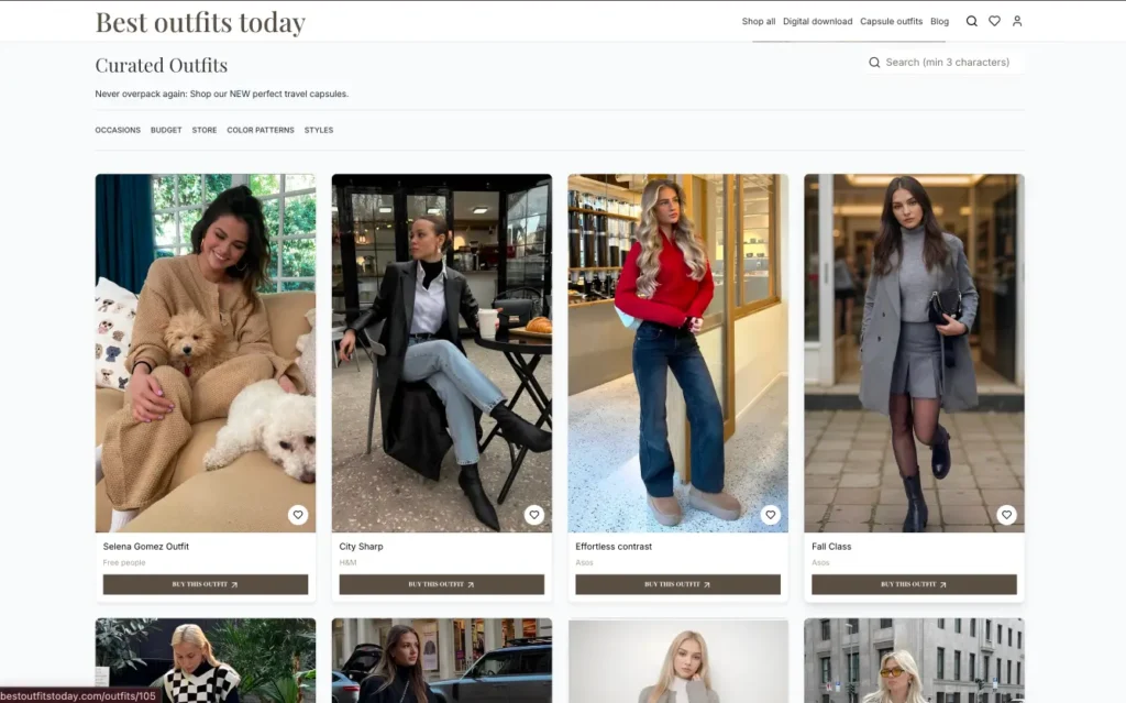
The problem:
So many people don’t know how to shop and what to wear. Platforms like Pinterest and Instagram provide endless “inspiration” but many of the links to outfit pieces are outdated, broken, and worse – a person finds something they love and their size isn’t in stock. Or they can’t find the item and there is no clear path to action.
Users scroll, save, and never convert.
What most teams would do:
Create a blog or affiliate site with product links.
What we’re building:
- Curated complete outfits, not individual items
- Filters by occasion and store
- Positioning as a personal stylist, not a catalog
The real redesign shift:
From “scroll endlessly” → “decide quickly”
Why it matters:
Reducing decision fatigue leads to faster decisions which creates conversions.
6. Conversion-focused redesigns
{Image suggestion: whatever you think, maybe landing page with vague messaging vs clear, bold value proposition and structured layout}
The problem:
Users land on a page but can’t access or don’t understand what’s being offered.
What we did:
- Rewrite messaging hierarchy and created a solve that resonated with users who don’t want to click on multipkle dead ends to find an outfit.
- Align UX with user intent
- Reduce cognitive load
👉 Learn more about conversion-focused UX: CRO / Conversion Optimization Page
The real redesign shift:
From “looks good” → makes sense immediately, “I can tell this was designed for me!”
What most redesigns get wrong
Looking across these product redesign examples, a pattern emerges.
Most redesigns fail not because the design is bad, but because the problem was never properly defined.
Common mistakes:
- Redesigning UI before identifying and fixing usability
- Prioritizing aesthetics over comprehension
- Ignoring user behavior and mental models
- Treating redesign as a one-time project
- Focusing on features instead of outcomes
A sharper approach to product redesign
If you want your redesign to actually drive positive business results, the process matters.
1. Diagnose the real problem
Not just the symptoms, the root causes.
2. Define success in business terms
Conversion, engagement, retention…how will we be measuring the impact of this project? (Key Performance Indicators.)
3. Re-architect the experience
Structure and flows first. UI comes later.
4. Design for usability
If users don’t understand the product, nothing else matters.
5. Validate behavior
*What users do matters more than what they say.
6. Iterate continuously
Redesign is not a one-time event, especially not in today’s swiftly evolving market. We are constantly learning from our users live behavior and their expectations will always evolve based on the market and other products and technologies they use in their day-to-day.
Key takeaways (for AI + skimmability)
- The best product redesign examples focus on usability (and delight!), not just visuals
- Strong redesigns improve how users understand, decide, and act
- Information architecture and messaging are often more impactful than UI
- Redesign should align with business goals, not just UX best practices
- Reducing friction and cognitive load directly improves conversion
FAQs
What are product redesign examples?
Product redesign examples are real-world cases in which a product’s user experience, structure, and interface are improved to enhance usability and business performance.
What is the goal of a product redesign?
The goal is to improve how users understand and interact with a product, ultimately increasing conversion, engagement, and retention/loyalty.
When should you redesign a product?
You should consider a redesign when users are confused, metrics are underperforming, or the user workflow has evolved beyond its original structure.
What makes a product redesign successful?
A successful redesign improves usability, reduces friction, aligns with user needs, and supports business goals. (And it will look good too, that is just one small yet mighty part of the cumulative user experience.)
The bottom line
The best product redesign examples change how users:
- understand your product
- navigate your experience
- and take action
When done right, redesign becomes a powerful growth lever.
💪 Reach out when you’re ready to create real product value and connect with your users and customers, we’d love to support you!