T’nuchamu is a real-time religious event coordination and geo-based alert automation platform designed to orchestrate time-critical, real-world coordination within a highly nuanced and complex religious framework. The system required layered business logic, role-based permissions, notification automation, donation flows, and dynamic event scheduling, all built around accuracy, cultural sensitivity, and operational trust.
When The Growth UX Studio joined the project, the product existed only as fragmented concepts. We transformed it into a structured, testable, scalable platform with clear flows, reliable logic, and a prioritized roadmap centered on accuracy, accessibility, trust, and real community behavior.
Before we started
When The Growth UX Studio joined the project, there was no live product and no active user base. The product existed only as fragmented concepts and was being built on WordPress, a platform that we would soon discover could not support the complexity of the project.
We transformed T’nuchamu into a structured, testable, scalable platform with clear flows, reliable logic, and a prioritized roadmap centered on accuracy, accessibility, trust, and real community behavior that can coordinate shiva logistics and minyan attendance across diverse Jewish communities, with full halachic (Jewish law) consideration, emotional awareness, and technological inclusivity for users who don’t use smartphones.
Before
What existed instead was a collection of disconnected Figma files, partially implemented ideas, and a development system that was already struggling under the weight of unclear flows, broken logic, and expanding scope.
Although the founder had invested years into the vision, the reality was that both the user experience and the technical foundation needed a fundamental reset in order for the product to work in real life.
Defining what must exist for an MVP
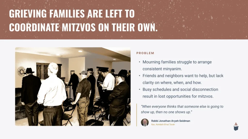
From the outset, the work required a lot more than design execution. This was a classic 0→1 startup problem with unusually high stakes: the platform needed to function for users in moments of grief, under immense time pressure, across devices, including smartphones and “dumb-phones”, while complying with complex religious Jewish law and community norms.
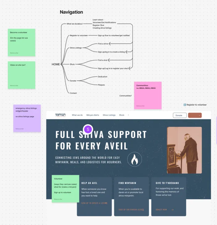
Mapping out user intent and user flows
Our first priority was to stabilize the product thinking. We worked closely with the founder and team to identify what had to exist for an MVP that could actually be used, versus what belonged in a future backlog that could only be validated once real usage began.
This consistent evaluation between “what must ship now” and “what can wait until the platform is lived in” shaped all of our design and product decisions.
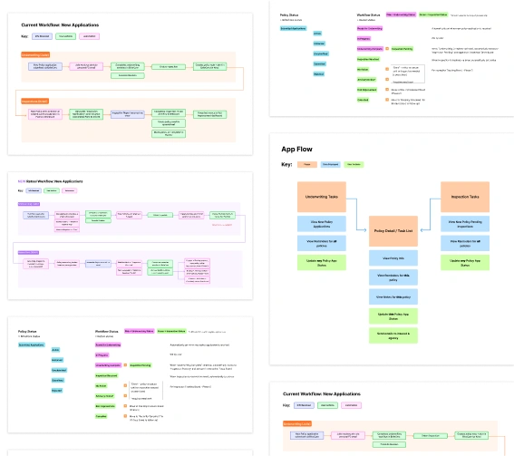
Establishing a unified design system
Unlike a typical greenfield project, we didn’t start with a blank canvas.
Multiple vendors had already produced screens, patterns, and partial implementations. The result was visual and behavioral inconsistency: mismatched components, duplicated styles, and interaction patterns that changed from screen to screen. This created confusion for users and slowed development.
Before refining flows further, we established a shared foundation inside Figma, and later inside WordPress and code:
- Accessible type scale and spacing system
- Consistent color tokens and status states
- Standardized form patterns for dates, addresses, and confirmations
- Reusable components for listings, alerts, and actions
- Clear interaction rules
This system let us redesign quickly without reinventing decisions each time
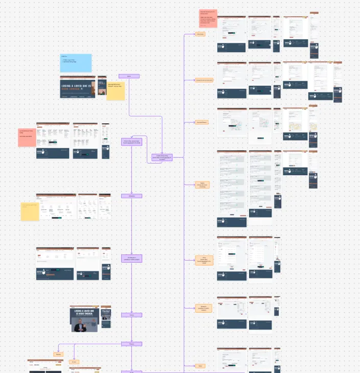
Using mid-fidelity wireframes to fix logic fast
Because real screens already existed, starting from low-fidelity sketches would have slowed us down and duplicated work.
Instead, once flows were mapped and clarified, we moved directly into mid-fidelity wireframes.
These screens used real structure, hierarchy, and content without final visual styling. That gave us enough detail to test usability and logic while staying fast and flexible.
This approach allowed us to:
- Rationalize inherited screens
- Remove redundant steps
- Align inconsistent patterns
- Validate flows with stakeholders quickly
- Hand off layouts developers could realistically build
Mid-fi became our sweet spot for this fast-moving project: concrete enough to evaluate, lightweight enough to change daily.
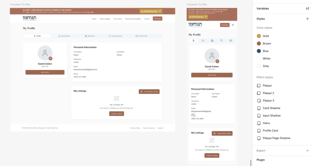
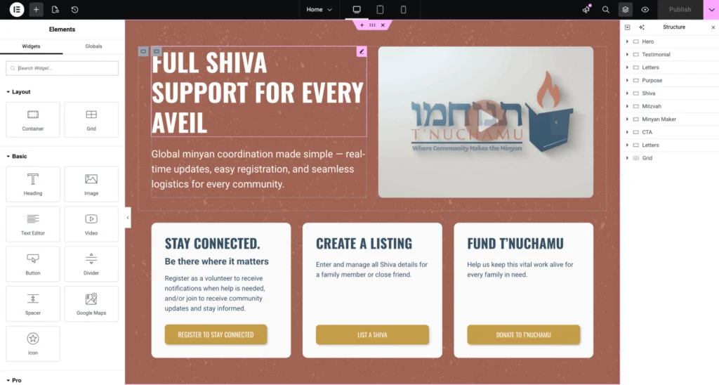
Elevating to High-Fidelity Design
Once flows proved reliable, we moved into high-fidelity design to unify the experience and bring the right emotional tone.
For a platform used during moments of grief, visual design needed to feel:
- Calm
- Clear
- Respectful
- Trustworthy
We focused on readability, simplicity, and strong hierarchy. Every component from the design system was applied consistently to create predictability, so people can easily understand what is required of them and move seamlessly to their next steps.
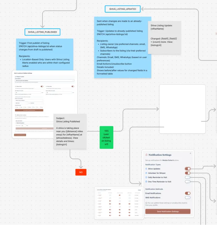
Designing the system that powers everything
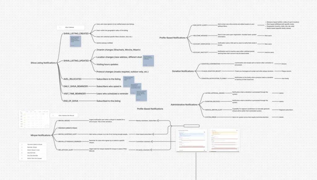
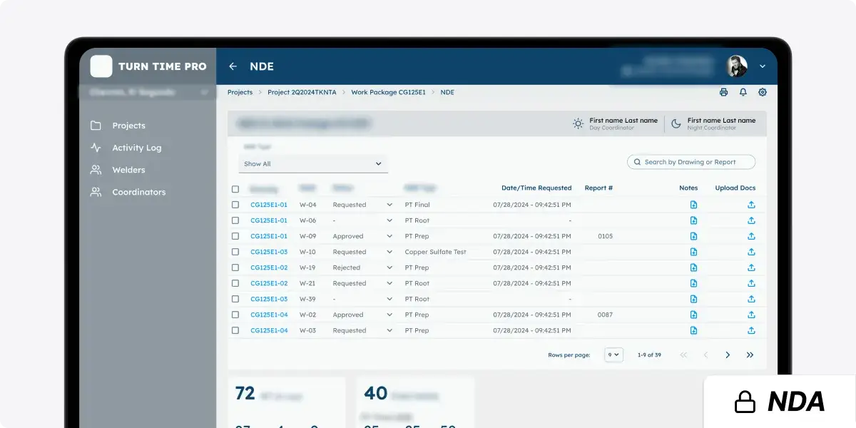
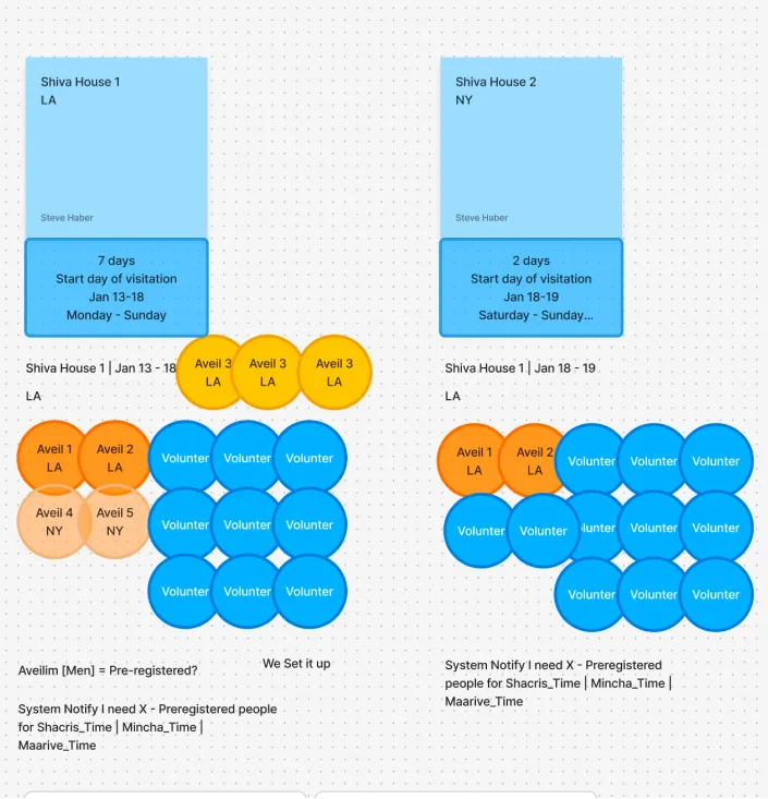
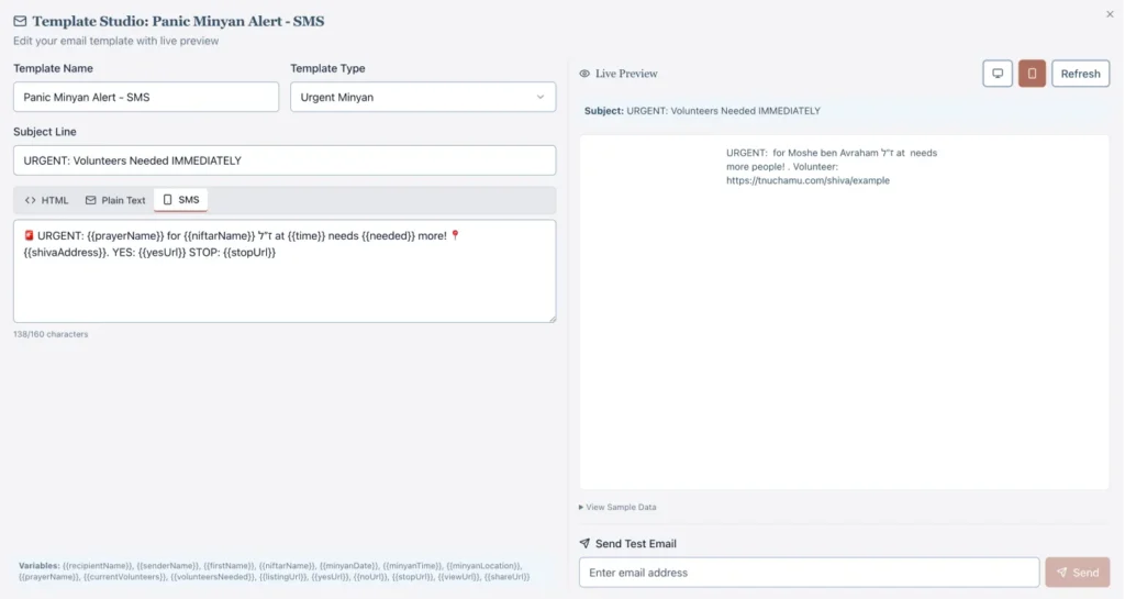
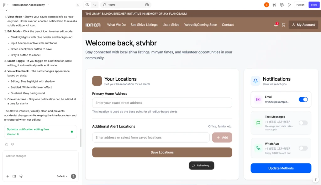
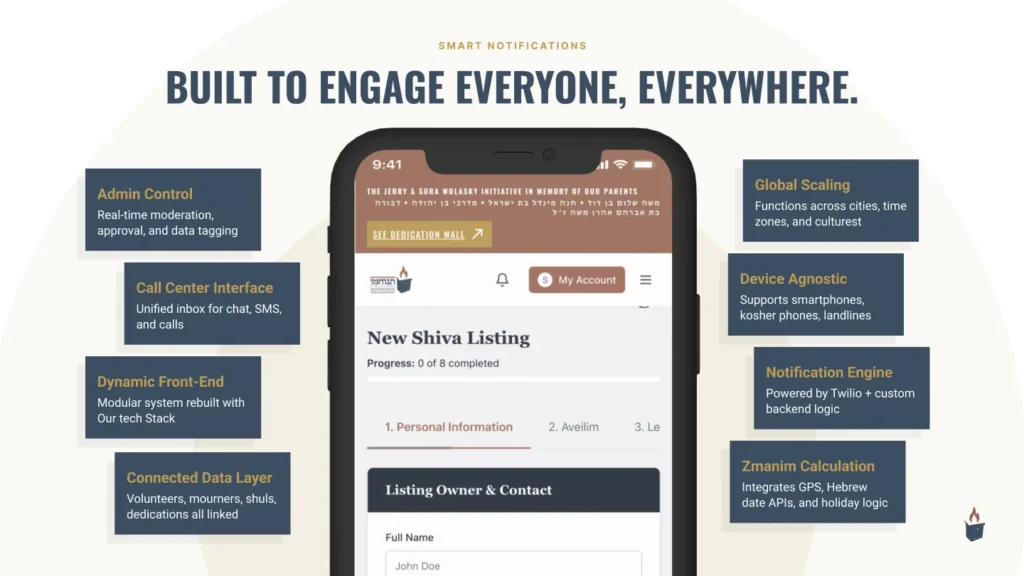
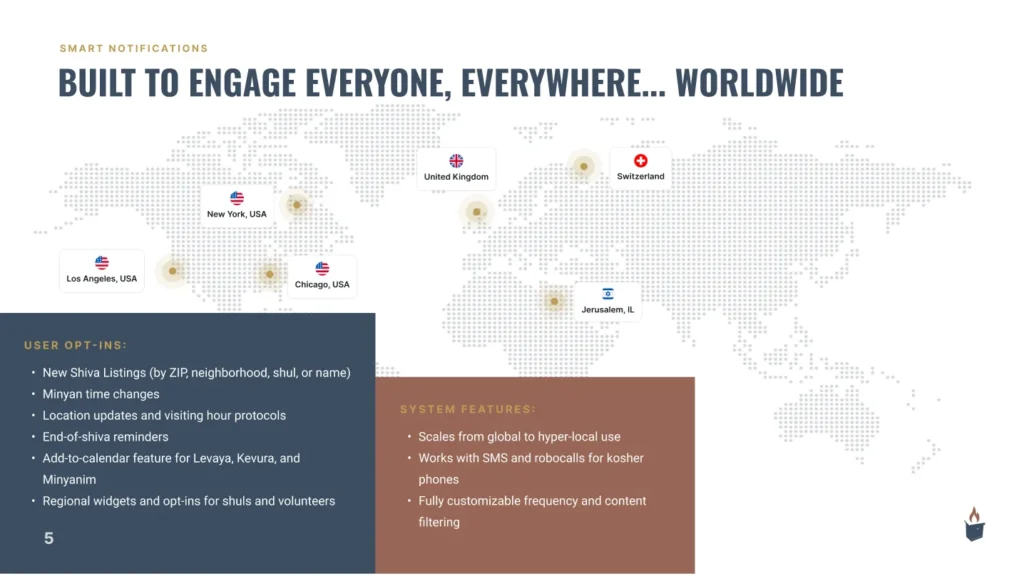
One of the earliest and most impactful focus areas was notifications. Alerts are the core engine of T’nuchamu—without them, the platform cannot fulfill its promise of ensuring minyan attendance.
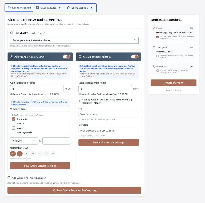
We intentionally designed the UI for non-technical users, shaping every interaction — from radius selection to notification preferences around human cognition.
Accessibility Beyond Smartphones
A critical requirement was full participation by users without smartphones, which the platform required in order to receive rabbinic approval for the community to use.
We worked through the logic of SMS-based interaction flows so that people using basic phones could confirm attendance, respond to requests, and triggering backend updates using simple text replies like “YES” or “NO.”
This work required careful coordination between UX, backend logic, and operational realities, including the future need for admin monitoring tools to ensure reliability at scale.
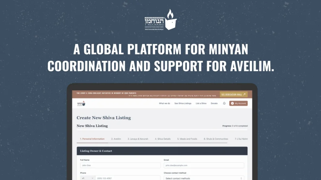
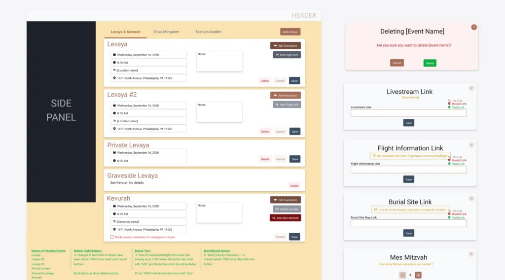
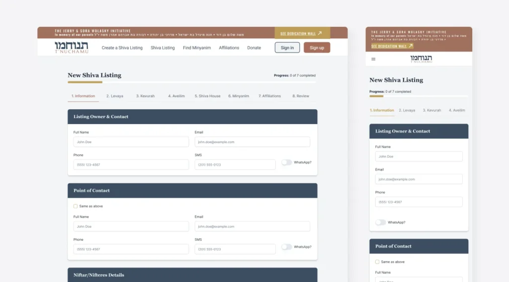
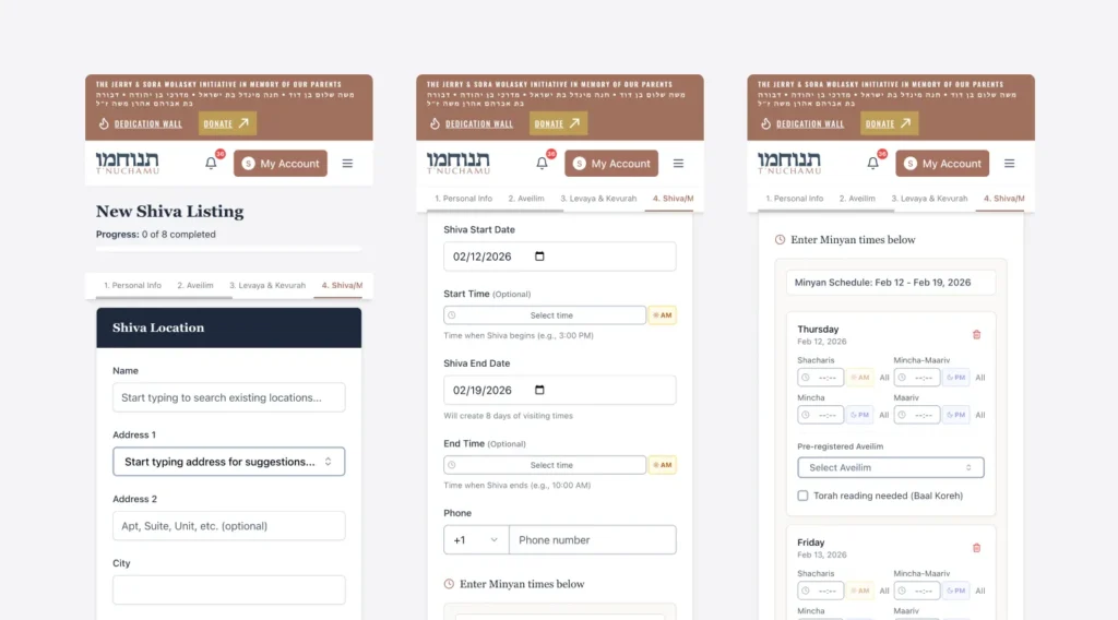
Simplifying Shiva Listing Creation
The shiva listing creation flow became another major focus area. Through live walkthroughs and real-time testing, we uncovered multiple points of friction that would prevent successful usage.
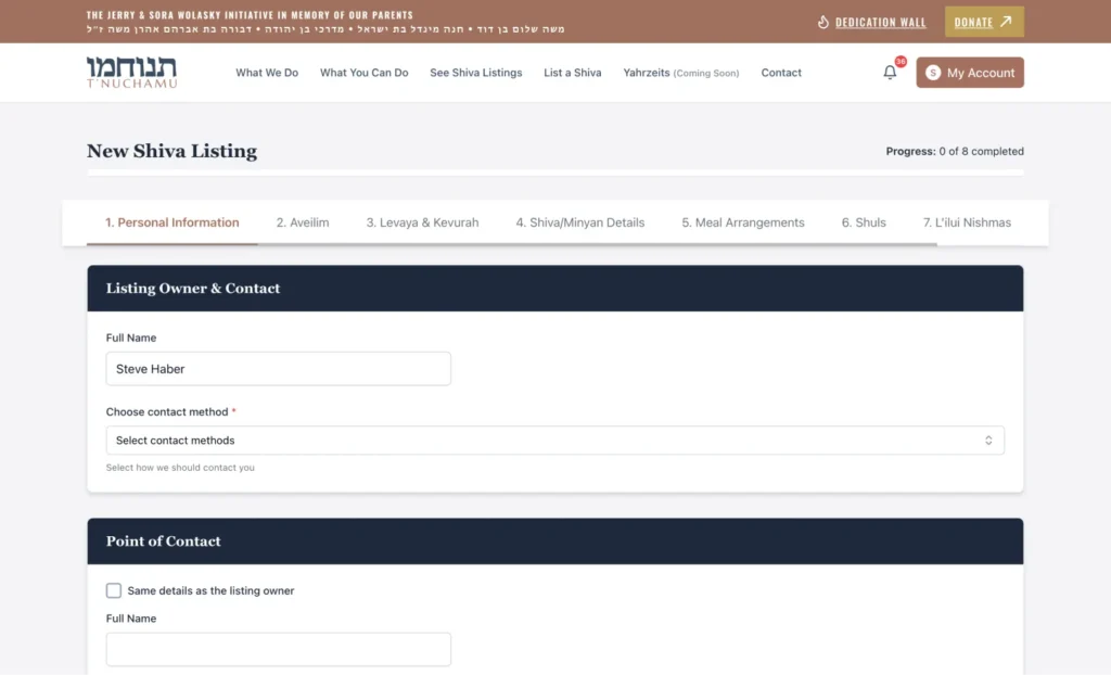
Users struggled to locate where minyan times were entered, particularly when the live implementation diverged from the original Figma designs. Address input caused confusion due to redundant fields and limitations imposed by Google Places autocomplete.
We resolved this by consolidating address entry into a clearer single-field model, preserving zip code accuracy as a critical requirement for location precision, and adding instructional guidance where external API limitations could not be controlled. These changes reduced user error and significantly improved confidence during listing creation.
Defining what must exist for an MVP
From the outset, the work required a lot more than design execution. This was a classic 0→1 startup problem with unusually high stakes: the platform needed to function for users in moments of grief, under immense time pressure, across devices, including smartphones and “dumb-phones”, while complying with complex religious Jewish law and community norms.
Our first priority was to stabilize the product thinking. We worked closely with the founder and team to identify what had to exist for an MVP that could actually be used, versus what belonged in a future backlog that could only be validated once real usage began.
This consistent evaluation between “what must ship now” and “what can wait until the platform is lived in” shaped all of our design and product decisions.
AI-Accelerated Product Development
As AI prototyping tools emerged during the project, we incorporated them into our workflow to accelerate ideation and feature validation. Using AI-assisted “vibe-coding” and tools like Figma Make, we quickly generated interactive prototypes to explore new concepts before committing engineering resources.
These tools were most effective when guided by clear product direction and defined user flows. With strong product leadership driving the experience design, AI allowed us to rapidly test ideas, refine workflows, and identify technical considerations early in the process.
Rather than replacing engineering, AI enhanced our development pipeline—reducing iteration time, improving communication between design and engineering, and ensuring features were validated before implementation.
This approach enabled faster innovation while maintaining intentional, user-centered design and technical rigor.
Fixing Dates, Times, and the Trust Layer
Date handling emerged as a high-risk issue. Because shiva timing and minyan schedules must be 1000% accurate, we identified and prioritized bugs related to Hebrew date conversion, day offsets, and browser inconsistencies.
Live testing revealed discrepancies across browsers, particularly Firefox, where date pickers and time selectors behaved unpredictably. We worked with development to investigate the underlying libraries, plan fixes, and introduce polyfills to ensure consistent behavior.
These issues directly affected the credibility of the platform.
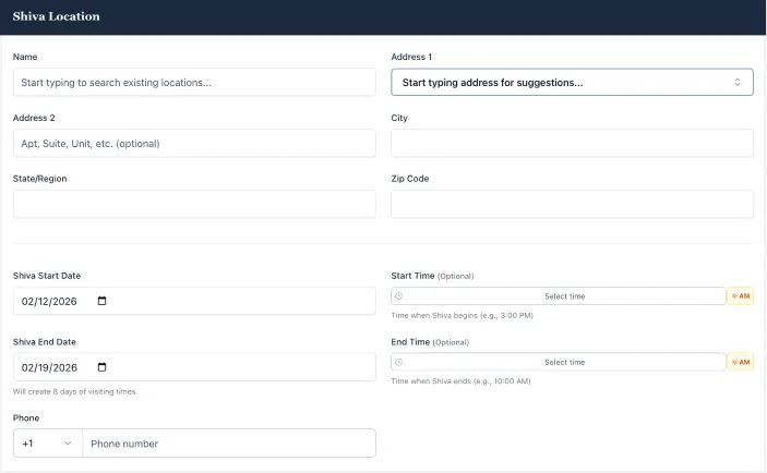
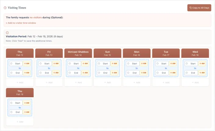
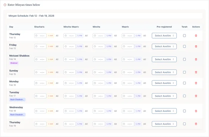
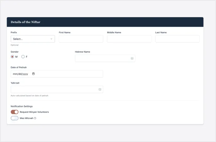
We also refined how shiva dates themselves are handled. The platform now defaults the shiva (Jewish mourning period) start date to the petira (a person’s passing) date and the end date to seven days later, reflecting traditional practice, while keeping both editable to accommodate real-world complexity.
We introduced optional start and end time fields to communicate realistic visiting windows, recognizing that families are often not available immediately after a funeral.
This approach balanced automation with human flexibility, which was one of the core design principles throughout the project.
The Donation Experience
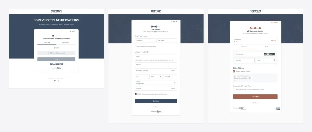
Parallel to the core flows, we worked extensively on the donation experience, syncing it to their current accounting tools like QGIV and ….
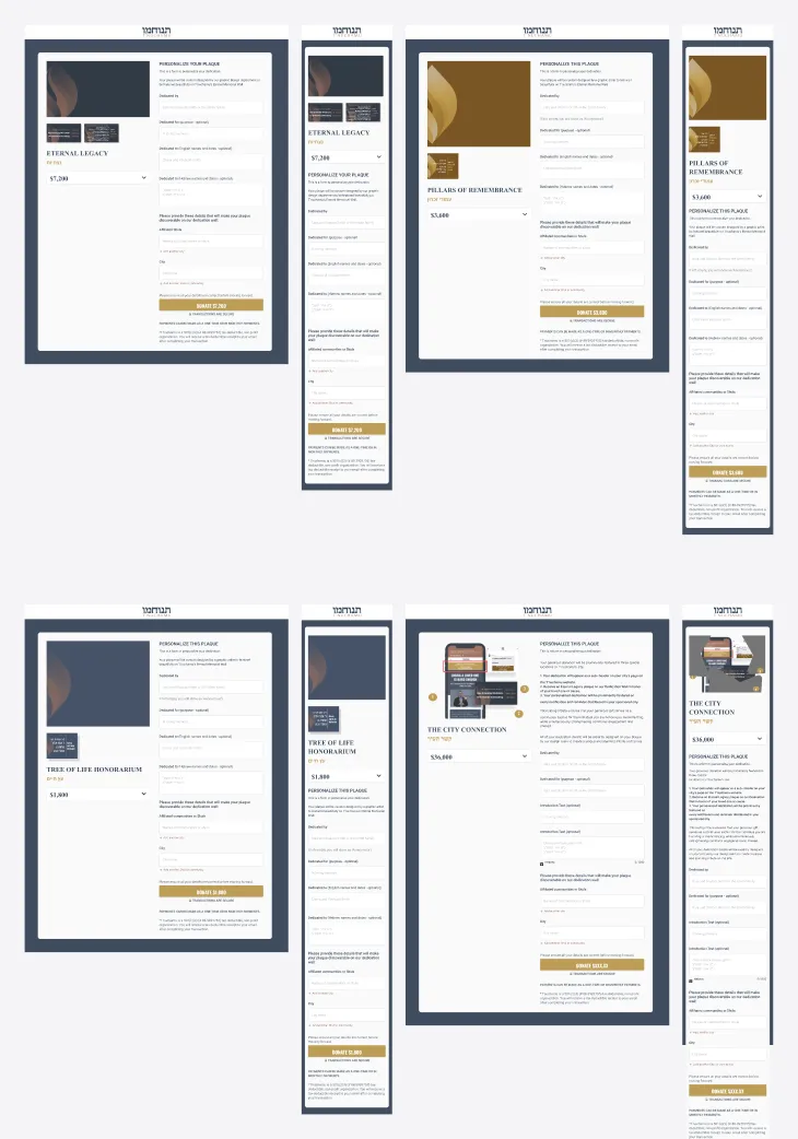
Parallel to the core flows, we worked extensively on the donation experience. The donate page is not just a funding mechanism; it is a trust moment.
We improved visual hierarchy, refined UI details, added security and credibility cues, clarified high-tier donation benefits, and pushed for full end-to-end testing of the donation flow in real conditions.
This work required close coordination across design, development, content, and graphic assets to ensure the experience felt respectful, transparent, and reliable.
Throughout the project, much of our Studio’s value came from operational leadership as much as design craft as we worked through daily new feature requests and feedback spanning everything from microcopy to backend logic.
The Growth UX Studio translated all feedback into structured documentation, prioritized action items, and clear decisions, preventing the project from collapsing under unbounded scope.
We facilitated difficult conversations, navigated complex vendor relationships, protected the integrity of the work, and kept the team focused on the critical path despite time zone differences, infrastructure disruptions, and shifting availability.
A System the Community Can Depend On
At the time of writing this case study, T’nuchamu is no longer a fragile collection of ideas. It is a live and evolving platform currently in marketing with clarified flows, improved accessibility, reliable logic, and a roadmap grounded in real usage rather than speculation.
The work so far demonstrates how UX strategy, product thinking, and operational discipline can transform a complex, emotionally sensitive concept into something that can genuinely serve a community when it matters most.