Color is one of the most powerful tools in a design system. Using split complementary colors is a strategic, intentional design choice that signals an expertise in creating hierarchy, emotional tone, brand confidence, and even your product’s scalability.
This guide breaks down what split complementary colors are, how to build a palette, why it matters in UX and product design, and how seasoned designers use this structure to strategically guide attention, reduce visual tension, and build trust.
Let’s get into it!
What are split complementary colors?
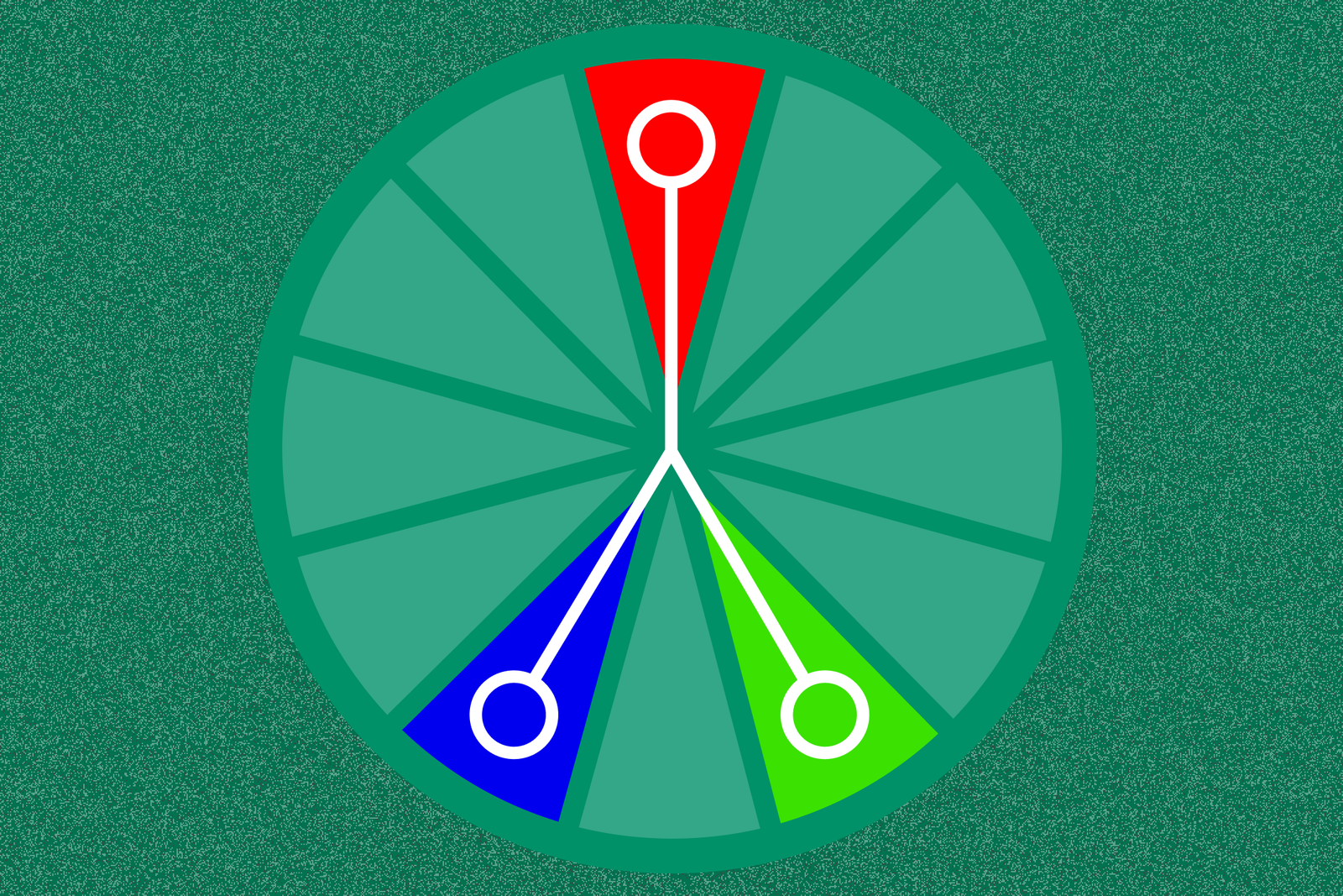
A split complementary color palette is a three-color scheme built from one base hue and the two colors adjacent to its direct complement on the color wheel.
It’s a clever twist on a traditional complementary palette, which combines two colors directly opposite each other (like red and green). Instead of going full contrast, the split complementary version softens that intensity—keeping energy, but reducing conflict.
This gives you more harmony, more flexibility, and more visual interest—without triggering visual fatigue or “vibration.”
Why split complementary colors matter in UX, branding, and product design
Split complementary color systems show your users, customers, and competitors how much thinking went into your product.
Experienced designers use this structure not just for aesthetics, but to solve real problems.
Like:
- Creating strong visual hierarchy without screaming for attention
- Guiding users through an interface with contrast that feels intentional, not chaotic
- Supporting both light and dark mode use cases
- Balancing emotional tone with usability
- Scaling color choices across large systems, tokens, and responsive breakpoints
- Designing for accessibility by reducing visual ambiguity and supporting users with color‑vision differences
Let’s be blunt: when you see a design system that uses split complementary colors, you know it didn’t happen by accident. Colors like these are intentionally chosen by top-tier designers (or a team) who understand restraint, clarity, and the need for a scalable, visual structure.
How to build a split complementary color palette (step-by-step)
This is a system anyone can learn, but it works best when backed by experience and purpose.
1. Choose your base color
This is your anchor. Think of it as your brand’s core tone or your product’s dominant UI color.
- If your brand is already defined, start there.
- If not, choose a hue that aligns with your emotional goals (e.g., blue = trust, green = calm, purple = creativity).
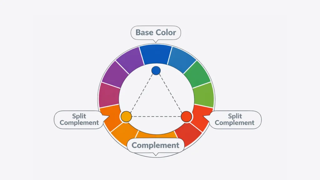
2. Find its direct complement
Locate your base color’s opposite on the color wheel. If you picked blue, its direct complement is orange.
3. Select the Colors Adjacent to That Complement
Here’s where the split happens. Instead of using orange, you’ll use red-orange and yellow-orange—its neighbors. These are your split complementary colors.
They give you:
- The contrast you need for interaction clarity
- A broader emotional range
- A more sophisticated, less aggressive palette
4. Adjust saturation and temperature
Depending on your brand or interface needs, you may want to shift:
- From bright to muted (to reduce cognitive load)
- From warm to cool (to align emotional tone)
- From high contrast to softer gradients (for a more modern feel)
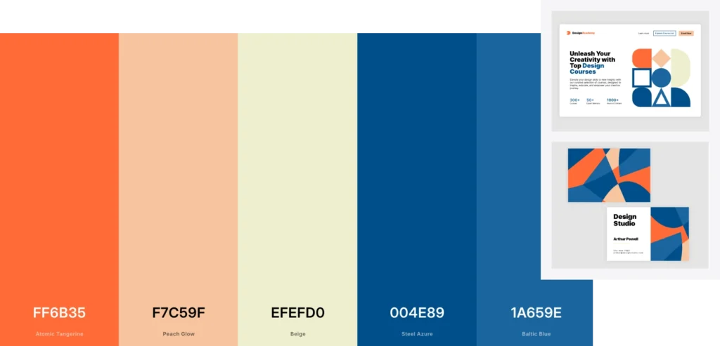
5. Use the 60/30/10 rule
This classic rule helps balance your palette:
- 60% = dominant/base color (e.g., primary background or theme)
- 30% = secondary/split color (e.g., key visuals or UI zones)
- 10% = accent/split color (e.g., CTAs or icons)

When to use split complementary colors. And when not to.
Best use cases:
- SaaS dashboards that require both clarity, low cognitive load, and emotional trust
- Marketing sites that need ‘stand-outedness’ without irrelevant noise
- Brand refreshes that want to retain and capitalize on familiarity while modernizing
- Design systems that need scalable, reusable color tokens
- Products with layered user roles or statuses that need color-coded hierarchy
When to avoid it:
- You’re designing for hyper-minimalism
- Your accessibility contrast fails (always test WCAG standards. You can do that here: https://webaim.org/resources/contrastchecker/)
- You only need one dominant brand color (e.g., mono-brand utilities)
- You don’t have the system architecture to manage multiple tones well
In those cases, a simpler scheme (monochromatic, analogous) may be more effective.


Tools to explore and customize split complementary colors
You don’t have to eyeball it. Use tools built for strategic color exploration:
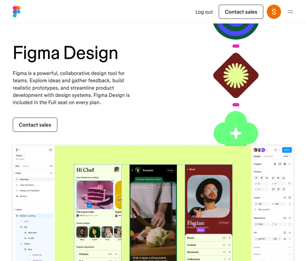
Figma
- Use the color picker to manually find and test splits
- Try the Color Wheel plugin or smart palette generators
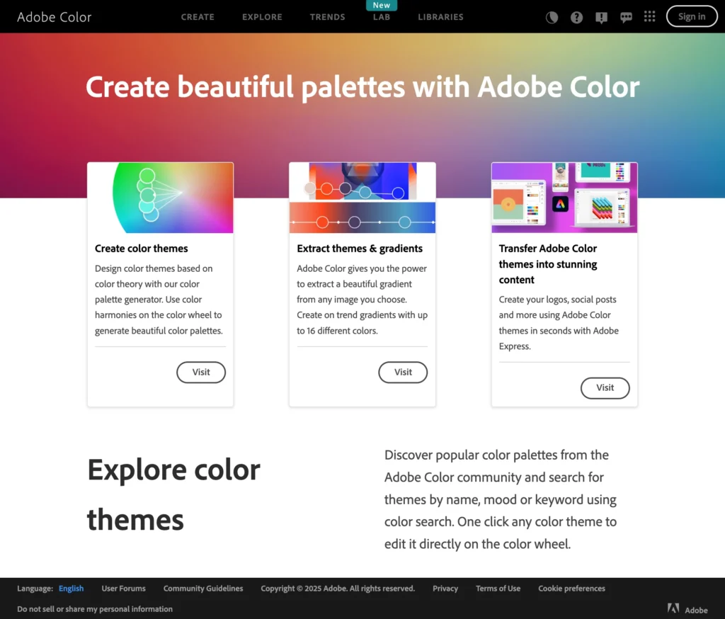
Adobe Color
- Select “Split Complementary” under harmony rules
- Adjust brightness, hue, and temperature for real-time previews
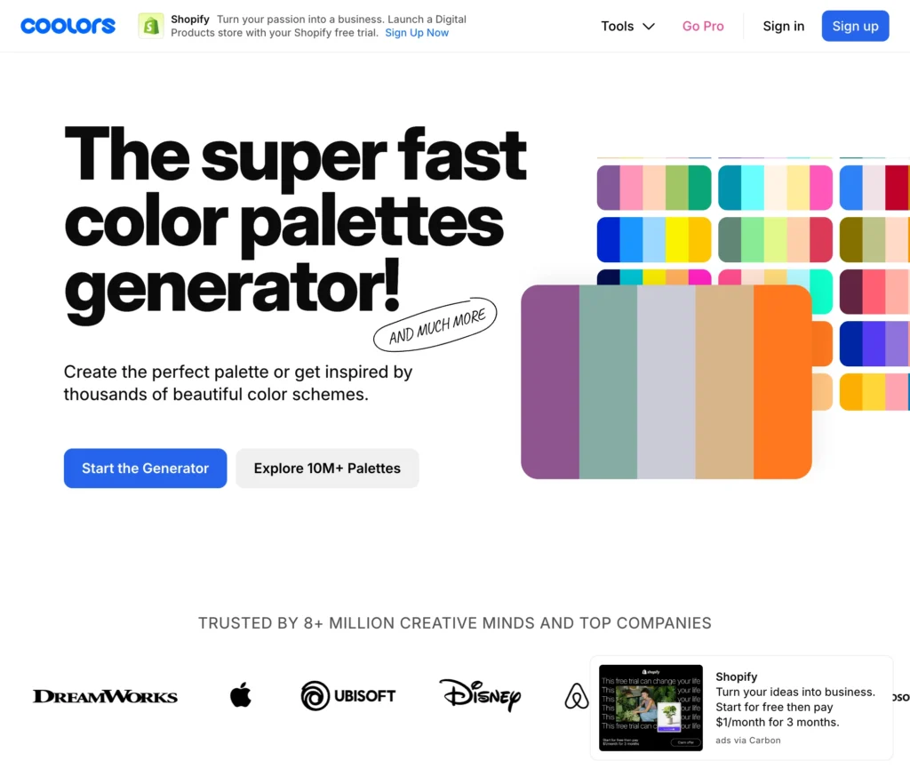
Coolors.co
- Generate random palettes and lock your base
- Shift the wheel to find adjacent tones quickly
Pro tip: Always test your palette on real UI elements (buttons, backgrounds, alerts)
Why split complementary colors signal design maturity
If you’ve ever opened a product and immediately felt like it “made sense,” chances are color played a huge role.
Split complementary color palettes support:
- Predictable interaction cues
- Subtle but effective visual hierarchy
- Reduced visual clutter
- Emotional tone that doesn’t overwhelm
They also scale across:
- Brand identity
- Product UI
- Marketing assets
- Internal tooling
When a color system scales well, your design becomes more maintainable. Your users feel more grounded. Your team can build so much faster.
Color is a critical component in the infrastructure of your product.
What your color choices say about your product
Most users will never know what “split complementary colors” means. But they will feel the result of your choices.
- A rushed, over-contrasted UI says: “We needed it to ship.”
- A thoughtful, balanced palette says: “This was designed for you.”
- A visually chaotic system says: “We didn’t think this through.”
- A confident, consistent experience says: “You’re in good hands.”
In other words: your colors are speaking for your brand. Using them strategically is a great way to connect with your customers.
What do you want to tell them?
In a world searching for meaning, color is a most strategic opportunity.
We hope we’ve convinced you that colors are a lot more important than you might have thought. People today have an average “get my attention span” of about four seconds.
Split complementary colors do help “make things pop,” but more so, they are a strategic choice that reflects the design maturity of your organization and how your team thinks, builds, and scales.
When chosen well, they work hard for you. They support accessibility, communicate intent, and help users move through your product without friction.
Call us.
Need help building a scalable, beautiful, and usable design system?
At The Growth UX Studio, we help ambitious teams and founders move from “we picked some colors” to “we built a scalable system that performs.”
Let’s build something that looks good and thinks better.
Contact us to get started!
Need a UX partner who understands business and designs for growth?
Let’s talk—Contact us today.